Comic Books

“In the Shadow of No Towers” by Art Spiegelman

This dark, troubling and sometimes hilarious 9/11 comic, created in a jumpy city uneasily balanced between Bush and Osama, may be the finest and most personal work of art to emerge from the tragedy.

  • more
    • All Share Services

“I take serious offense to the RNC being in my fuckin’ city; it’s really pissing me off. It’s the same scumbags who don’t live anywhere near you, but are still going to organize a force to stop you from having an abortion — because they care about you. The same people want to feel our pain over 9/11, but they don’t realize that we’re in a completely different place. The people who actually experienced it have no connection to these people coming in. They didn’t experience it, they don’t understand what we feel, and they don’t understand us. It’s just manipulation.”

– Brooklyn, N.Y., rapper El-P

Art Spiegelman’s works, especially the groundbreaking Holocaust comic “Maus,” have always been as much about phenomena occurring outside his vertiginous comic strip frames as about the events within them. This is because the world around the famed comix lifer has always seemed on the verge of annihilation — as he confesses more than once in his sprawling, sharply satirical “In the Shadow of No Towers,” a collection of strips built by Spiegelman over the last three years and finally published by Pantheon Books just before the third anniversary of 9/11.

In his foreword to “No Towers,” Spiegelman writes that the book’s gorgeous “single-page units,” printed on 42 pages of heavy card stock and designed to resemble the Sunday newspaper comics panels of a bygone era, “corresponded to my existential conviction that I might not live long enough to see them published.” His parents’ ordeal in Auschwitz at the hands of the Nazis, he goes on, taught him to “always keep [his] bags packed.” Spiegelman freely admits that the psychic terrors of 9/11 corresponded to a deep-seated “self-inflicted” trauma, a fervent belief that Armageddon — both the religious conflict and the Bruce Willis movie — was, as the Rolling Stones sang in “Gimme Shelter,” “just a shot away.”

This kind of unrelenting dread has kept artists of all kinds in full sublimation mode since the invention of the cave drawing, and has provided human culture with no shortage of standout works. But this latent fear has also invigorated the capitalist schadenfreude of everyone from Fox News to Manhattan street merchants to the Bush administration, not to mention the supposedly liberal New York publications that avoided Spiegelman’s post-9/11 rants like they were undocumented Arab immigrants. And Spiegelman, always the astute cultural critic, knows this better than anyone.

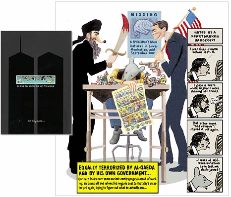
Indeed, his July-August 2003 installment of the “No Towers” series dedicates itself to the profit others have reaped off the backs of citizens thrown into chaos by a national tragedy. In one of two vertical strips (as with everything Spiegelman, the arrangement and construction of his comics deviate from standard convention whenever possible), one of the artist’s doppelgangers holds up a garish tourist trap clock emblazoned with the twin towers, a looming American eagle, FDNY figurines and a United States flag, confessing that he was an eyewitness and even a participant in “the bombardment of kitsch” that hit the U.S. after 9/11 like an X-rated Xtina video on Kazaa.

In the second strip, the same clock blows up like a bomb in Spiegelman’s face, as cowboy boots branded with dollar signs fall from the sky on a fleeing populace filled with cartoon legends like Annie, Wimpy, Hapless Hooligan (who repeatedly serves, as do the meek mice from “Maus,” as a Spiegelman alter ego), Charlie Brown and many more. Even this summer’s Republican National Convention — the capitalization on misfortune to end all capitalizations on misfortune — is identified by the author as an example of tragedy “transformed into travesty.”

This must-have collection of hard-hitting, self-deprecating strips on life during wartime was ignored during its creation by the very publications that made Spiegelman a big name in New York literary and artistic circles: the New York Times, the New York Review of Books and the New Yorker (which has both commissioned Spiegelman for cover art and employed his wife, Françoise Mouly, as an art editor). As he admits in the foreword, “Outside of the left-leaning alternative press, mainstream publications that have actively solicited work from me … fled when I offered these pages or excerpts from the series.” In fact, the only mainstream homes for his controversial work were found in the countries — Germany, France, Italy, the Netherlands — that were lambasted by Donald Rumsfeld and George W. Bush as “old Europe” and derided by the American media.

In a sense, this neglect helped push the work further. “The feelings of dislocation reflected in these ‘No Towers’ pages,” Spiegelman writes, “arose in part from the lack of outcry against the outrages [of the Bush administration] while they were being committed.” Now, in the most heated political season of recent generations, those who once spurned Spiegelman’s work have recovered their cojones, and “No Towers” is something of a hot commodity.

New Yorkers like rapper El-P, quoted above, are justifiably sick and tired of facile 9/11 sympathies that turn out to be marketing gimmicks. But no one’s going to accuse Spiegelman of cashing in on the tragedy’s third anniversary, and not just because he is a New York lifer who has consistently raged against the machines of oppression and manipulation since his days editing the seminal ’80s graphic mag Raw. The Pantheon press kit is now packed with fawning headlines from the publications that showed him the door two years ago, but Spiegelman can only control what ends up on the spectacular colored pages that set “In the Shadow of No Towers” apart from every other 9/11 interrogation.

As Spiegelman notes in “No Towers” while fleeing the crumbling World Trade Center and encountering a giant billboard for Arnold Schwarzenegger’s fireman-revenge drama “Collateral Damage,” irony is not dead. Neither is the idea that art can sometimes transcend the pleasure, pain and callous commerce of the world that generates it. Spiegelman’s highly personal exploration of the horrors of 9/11 and how they nearly destroyed him (even as they were being perverted by the “Architects of Armageddon,” as he calls Bush, Cheney and Rumsfeld, into a blank check for imperial aggression) offers a more powerful criticism of postmodern America’s state of affairs than most of those found in this season’s Bush-bashing titles. Even better, this lavishly produced, eye-popping collection costs only $20 — a bargain for a work of comics art this sophisticated (and likely to become a collector’s item).

If anything, the fact that the American intelligentsia finally seems ready to admit that Spiegelman was speaking truth to power in the dark years of 2002 and 2003 ought to make us sleep a little better at night — at least until, as Spiegelman explains in “No Towers,” the sky starts falling again and the duct tape market catches fire.

Continue Reading Close

Scott Thill is the editor of Morphizm.com. He has written on media, politics and music for Wired, the Huffington Post, LA Weekly and other publications.

That’s not the original Hulk!

Even in books dedicated to his work, famed comic artist Jack Kirby's drawings never appear on the cover

  • more
    • All Share Services

That's not the original Hulk! (Credit: Dean White)
This article originally appeared on Imprint.

ImprintJack Kirby is widely recognized as one of the most important comic creators of the 20th century. Co-creator of Captain America, the Fantastic Four, the Hulk, the X-Men, and creator of Darkseid, The Demon, OMAC and myriad others, he still can’t get no respect.

Early in 1992 my phone rang. At the time I was an art director at a book publisher in Manhattan, and it was some time before I learned the art of being taken to lunch. On the other end was a book agent. “Do you want to go to lunch?” “No thanks,” I replied. “Then I guess you don’t want to meet Jack Kirby?” Less then an hour later I walked into the lobby of the hotel where the Kirbys were staying. I was the first to arrive, and walked over and introduced myself to Jack and Roz. The raison d’être for the meeting was that Jack and Ray Wyman were shopping around “The Art of Jack Kirby.” I will save the details of that meeting for another time, but suffice it to say Jack regaled me with war stories over lunch, and I met one of the greatest influences on my early life. Unfortunately I could not convince my publisher how important I believed the book to be. Sadly, almost exactly two years later I learned Jack had passed.

Jack Kirby characters

The Art of Jack Kirby, by Ray Wyman, (The Blue Rose Press, 1992). The cover is signed “Kirby/Eastman” but there’s little evidence of Kirby. Kevin Eastman is the co-creator of the Teenage Mutant Ninja Turtles and also wrote the foreword.

A short time afterward I took a trip with my family to San Francisco and we visited the Cartoon Art Museum there. Truth be told, I only had a cursory interest in comics at that time. Although a friend tried to keep me abreast of current “good” comics (“Dark Knight Returns” and “Watchmen”), my interest had waned after Kirby left DC in the mid-1970s and I had lost track of him and the comic book industry in general. Much to my surprise “The Art of Jack Kirby” sat on a shelf for sale. But something was wrong. The cover didn’t look like Kirby, and although it was signed “Jack Kirby / Kevin Eastman” I could discern very little Kirby at all. In a decision I’ve regretted every since I passed up the chance to buy a copy based on the cover, and have yet to find an affordable copy.

Cut to present day and it was with great expectations to see that a university press would be publishing Charles Hatfield’s “Hand of Fire: The Comics Art of Jack Kirby.” Hatfield, after all, is a college professor of English at California State University, Northridge, and the author of “Alternative Comics: An Emerging Literature,” as well as many articles over the years for “The Jack Kirby Collector.” However, when I finally saw the cover I had that same sinking feeling I had years earlier: “That doesn’t look like Kirby.” Sure enough, as Hatfield explained on his blog: “Re: the cover, I love Geoff Grogan’s image, and I’m proud to have it! I commissioned it. The Press and I discussed many options for the cover. There were legal constraints, of course. The decision to go with a new, original illustration rather than a photo of Kirby was my call. I’m digging the results!”

Kirby, hand of fire

Hand of Fire: The Comics Art of Jack Kirby by Charles Hatfield (University Press of Mississippi, 2011), illustration by Geoff Grogan.

As I designer I know there were infinite possibilities, regardless of the rights issue, beyond a choice of a photo or Kirby art. With all due respect to Geoff Grogan I am hard-pressed to understand why someone would opt for an imitation of the artist the book is about. Can you imagine a book on Matisse, Picasso or Pollock, or pretty much any “fine” artist, with faux art on the cover? For me it represents that a serious take on comic artists and Kirby in particular still has a long way to go.

Published almost simultaneously this year was “Lee and Kirby: The Wonder Years,” an oversize trade paperback edition of “The Jack Kirby Collector,” written by the late Mark Alexander, with a cover (and interior) designed by publisher John Morrow. Unfortunately, once again, for a book about Lee and Kirby’s “Fantastic Four” years, Kirby is nowhere to be seen on the cover.

Wonder years

Lee & Kirby: The Wonder Years by Mark Alexander, (TwoMorrows Publishing, 2011) design by John Morrow.

Actually both these tomes represent a long-standing tradition of packaging books about and containing art by Kirby with someone else’s art on the covers. Kirby drew hundreds or more covers in his lifetime, yet apparently isn’t qualified to grace his own books.

An early example of this is the “Silver Surfer Novel,” published by Marvel/Fireside Books in 1978. Hailed as the first new (and final) collaboration in many years between Stan Lee and Jack Kirby, “All New…The Ultimate Cosmic Experience!” Lee and Kirby shared equal billing on the cover over a painting by Earl Norem.  Perhaps the conventional wisdom was that “painted covers look like paperback covers,” yet when Marvel signed a deal with Lancer books in the mid 1960s to reprint their comics for the first time in mass-market paperback format, it was recycled (and pastiched) Kirby art that they utilized.

Silver surfer novel

The Silver Surfer by Stan Lee and Jack Kirby (Fireside/Marvel 1978), cover painting by Earl Norem. In contrast to the Lancer paperback from 1966, which featured Kirby art.

Lancer paperback

Marvel continued this practice going forward. The cover of “Fantastic Four” Number One, November 1961, is one of Kirby’s most iconic covers. For Marvel’s “Fantastic Four Omnibus” Volume One (2005), which contains only Kirby’s art within, they featured an Alex Ross painting based on the cover, although they did issue a variant cover as well as one with Kirby’s original cover. Covering the same material with Kirby’s name once again featured prominently, the “Fantastic Four Masterworks” Volumes One through Six, issued in 2009, displayed covers by Dean White. For the “Fantastic Four Omnibus” Volume Two they issued an alternate with a painting by Mexican artist Ladronn. “The Hulk Omnibus” and “Masterworks” volumes sport competing “interpretations” by Ross and White, respectively. “The Avengers Masterworks” Volumes One and Two again featured cover art by White while prominently flaunting the Kirby moniker; likewise “Captain America Masterworks,” “The Avengers Omnibus,” and “Thor Omnibus” series. According to Marvel, “Thor” contains: “The painstakingly restored classic tales that gave birth to the greatest saga of myth and adventure to ever grace the comic book page!” Similarly, despite touting Kirby, the “Tales From Asgard Omnibus” selling copy boasts “Read these stories as never before with all-new, modern coloring and six extraordinary interlocking covers by current THOR artist Olivier Coipel. For the record, Marvel, unlike DC and many other publishers in these days of high-res scans, has continued the practice of hiring artists to trace and recolor the original pages, so one can make the argument that you aren’t getting Kirby art in the interiors as well.

Dueling Fantastic Four Number Ones: Kirby’s original...

... Alex Ross ...

... and Dean White reinventions. The White covers are signed Kirby/White although the art is only based on Kirby’s.

In 2008 Abrams published the Eisner Award winning “Kirby: King of Comics” by Kirby biographer and former assistant Mark Evanier. While not his long awaited biography, this coffee table book featured beautifully reproduced artwork plus a succinct biography. The cover, by designer Paul Sahre, solved the rights issue, as well as which Kirby art does one display from what comic book company, by creating a dynamic wraparound collage featuring tightly cropped images of various elements and characters: a gray Hulk, a hint of Captain America’s shield, a rocketship, etc. Unfortunately, Sahre left mid-project due to creative differences, so the interior does not display the same level of creativity he was able to put on view earlier with “Maximum Fantastic Four,” with its inventive folded poster cover and panel-by-panel enlargements, a tribute to “FF” #1, ironically published by Marvel in 2005. The Abrams cover was a toned-down version of Sahre’s original design and oddly, they chose to devote a gatefold to an Alex Ross “interpretation” of a Kirby splash, quite a bit of real estate to give away for a work of art not by the subject at hand.

Paul Sahre’s original Kirby: King of Comics cover (Abrams, 2008). The published version removed Sahre’s wrap around white lettering.

Likewise three versions of The Incredible Hulk by the same trio of artists

The Incredible Hulk, art by Alex Ross

The Incredible Hulk, art by Dean White

Kirby's iconic world eating godlike Galactus reinterpreted by Ladronn andWhite.

Sahre’s inventive poster cover for Maximum Fantastic Four (Marvel, 2005) that folds out to reveal Kirby art for the cover of Fantastic Four number one.

One can only hope that when Evanier finally gets around to publishing his biographic opus on Kirby that the cover will feature art by the subject, or a design that pays tribute without resorting to simulation or trying blatantly to appeal to a contemporary audience. Sometimes imitation is not the highest form of flattery.

Copyright F+W Media Inc. 2012.

Salon is proud to feature content from Imprint, the fastest-growing design community on the web. Brought to you by Print magazine, America’s oldest and most trusted design voice, Imprint features some of the biggest names in the industry covering visual culture from every angle. Imprint advances and expands the design conversation, providing fresh daily content to the community (and now to salon.com!), sparking conversation, competition, criticism, and passion among its members.

Continue Reading Close

Steven Brower is a graphic designer, writer and educator and the former Creative Director/ Art Director of Print. He is the author/designer of books on Louis Armstrong, Mort Meskin, Woody Guthrie and the history of mass-market paperbacks. He is Director of the “Get Your Masters with the Masters” low residency MFA program for educators and working professionals at Marywood University in Scranton, Pa. @stevenianbrower

Comic books’ undercover hero: Tibet

An exhibition at New York's Rubin Museum showcases the Asian country's surprising prominence in comic culture SLIDE SHOW

  • more
    • All Share Services

Comic books' undercover hero: TibetFrom the cover of "Green Lama."(Credit: Rubin Museum of Art)

View the slide show

Which Himalayan country has had guest-starring gigs in some of the century’s most popular comics? If you guessed Tibet — a safe choice based on this interview’s headline — you’re spot on.

A new exhibition at New York City’s Rubin Museum (an institution wholly dedicated to the art of the Himalayas) will show you “the most complete collection of comics related to Tibet ever assembled.” A number of them may already be familiar to you; as curator Martin Brauen explained to me this week, popular comic figures like Donald Duck, Lara Croft and Tintin all make appearances. All the comics — from the obscure and frivolous to the overtly political — capture Tibet as it has been perceived by artists and readers at different points over the course of past several decades.

Click through the following slideshow for some truly remarkable images from the exhibition.

Why did you decide to do this exhibition now?

Well, soon the movie of “Tintin” is coming out, so it’s perfect timing … But that was not known to me when I planned this exhibition about two years ago. I had actually done a similar exhibition a long time ago [at the Ethnographic Museum of the University of Zurich]; it was a larger one, called “Dreamworld Tibet,” made up of all these strange, funny unknown pictures or imaginations regarding Tibet, from novels, Hollywood movies — and, among other things, also comics. When I came to the Rubin about three years ago, I [decided] to do an exhibition here only about the comics, which makes sense because, as you know, comics are considered nowadays more and more as “art.” And since I’ve chosen about 50 comics related specifically to Tibet, it fits into the Rubin’s general subject of Himalayan art.

I like to explore new subjects; I also think very often things like comics are considered as something that should not be represented in a museum. I remember when I applied for a grant for my studies regarding the “Dreamworld Tibet” exhibition, I applied for money from a well-known institution called the Goethe Institute. They wrote me back and said something like: “We are not financing research about trivial culture because the result would also be trivial.” That reflects the opinion of quite a number of people. With this, I wanted to show that actually, it’s really interesting to go deeper into this subject of comics — and we can learn a lot.

How did you originally notice that Tibet was such a powerful theme in comic-book literature? Do you think this is something that people who read lots of comics will already be familiar with? Or will it be surprising, even to comic fans?

I think for most people it will be quite a surprise to see so many comics related to Tibet. Most of the visitors might know “Tintin in Tibet” or might know that Lara Croft once went to Tibet to find a so-called “Black Mandala.” Some might also know that Dr. Strange was in touch with a guy who stayed in Tibet, and he got a lot of teachings from him. But [the sheer number of] characters from the comic world who have been in Tibet is really quite surprising; there’s Mickey Mouse, Donald Duck, Uncle Scrooge, Lara Croft, Dr. Strange, Bugs Bunny — and even other, less well-known ones … In the earliest comics we are showing, from 1944 and 1945, the star is the so-called “Green Lama,” who seemed to be quite popular in his time. He’s now almost forgotten.

Are there any specific stereotypes or generalizations about Tibet we find repeated in these comics?

Since this is an exhibition related to Tibet, of course the stereotypes relate to Tibet. But if you study comics related to somewhere else — Africa, maybe — I’m sure you’ll find similar stereotypes related to that country. For Africa, “Tintin in Congo” is a good example; it’s often criticized [for being] racist. Whereas “Tintin in Tibet” doesn’t contain any racism. But you do find some sorts of stereotypes: For instance, the “levitating monk” appears in “Tintin” as well as many other comics, and also of course this creation of the Yeti, the abominable snowman.

I realized when I went deeper into these comics that certain personalities have influenced our view of Tibet quite strongly, although most of us are not aware of it. For example, early missionaries were fascinated with all the pomp and grandeur of Tibetan Buddhism; they compared it with Christianity, with Catholicism, and they felt that there must be some relationship between the religions. Because of that, I think — although I can’t prove it — that the missionaries were quite in favor of Tibetan Buddhism … They were fascinated by the Dalai Lama, whom they compared with the pope; they were fascinated by the Potala, the winter residence of the Dalai Lamas — and all this you can find in comics and in novels and in Hollywood movies about Tibet. What appears again and again is this hierarchy, with the Dalai Lamas on top, and then below, some monks and other normal people.

Another person who influenced our notion of Tibet very much was a half-Russian lady called Helena Blavatsky. She was the founder of the Theosophical Society, and she had quite weird ideas about Tibet (for instance, she claimed she had been in Tibet, which is quite clearly not true). She said she had telepathic relationships with two so-called Mahatmas — sages living in Tibet — and and that they would tell her what to do. Interestingly, these two Mahatmas were not Tibetans, but were Indians of Aryan origin. This is a subject that comes up in many comics again: a superhero or a “lama” who is very powerful, but in most cases — actually in all cases — is not Tibetan but white.

For example there’s a novel by James Hilton called “Lost Horizon”; it was a bestseller that sold many many millions of copies in the 1930s, ’40s and ’50s. Hilton invented the idea of Shangri-La, this place somewhere in Tibet where a sort of brotherhood resides. This idea is taken up in some of the comics. But this brotherhood is again full of white people — no Tibetans.

In general, as long as you don’t think “This is actually Tibet,” it’s fun! These are fairy tales; they’re entertaining, but a lot of things which are depicted are, of course, wrong.

For Westerners, what is the connection between the supernatural and the East?

It’s a good question, because Westerners have a way of seeing Tibetan events as somehow special or magical. For example, these “levitating monks,” or monks who can appear and disappear. Now, this is not only a Western notion; that’s the interesting part of the whole thing — because if you go to Tibet and if you read the stories, you very often read lot of these things there, too … I would compare quite a number of these comics to fairy tales — I mean, in fairy tales you find similar things: miraculous activities, miraculous events, etc. But in this case, sometimes they are taken from Tibetan stories.

The exhibition also contains some biographical comics; one particular one is about a Tibetan saint called Milarepa. Milarepa, for Tibetans, is known as a very magical person, who can do things normal people can’t do; this is depicted in the two comics we are showing in the exhibition. In the show, we juxtapose traditional Tibetan paintings of Milarepa … with examples of how Dutch comic art has depicted the same scenes, so you can compare the Tibetan way — the traditional way of depicting the saint’s life — and with the ways Dutch comic art has depicted the saint.

“Hero, Villain, Yeti: Tibet in Comics” is on display at the Rubin Museum of Art in New York City through June 11, 2012.

View the slide show

Continue Reading Close

Emma Mustich is a Salon contributor. Follow her on Twitter: @emustich.

Tales from the other Comic Con

Unlike its San Diego cousin, the Long Beach version is still all about cartoons and graphic novels

  • more
    • All Share Services

Tales from the other Comic Con
This article originally appeared on Imprint.

Kevin Eastman

These days, the so-called San Diego “Comic” Con’s main attraction is sugary TV and movie confectionery. But if you enjoy graphic novels and cartoons – and, well, scary stuff – you may have attended the recent Comic & Horror Con at Long Beach, Calif.’s Convention Center.

While SDCC has been around for over 40 years, the relatively pint-sized LBHCC just started in 2009. But it certainly doesn’t seem new. In fact, it feels downright retro. Sure, it had its panel sessions about “Robot Chicken” and Web comics and “Transmedia.” But the longest lines of autograph seekers were for Kevin “Teenage Mutant Ninja Turtles” Eastman and, well, John “Halloween” Carpenter… 1980s, anyone? Hell, there was even a stage for group readings of “The Tell-Tale Heart” and other such classic radio drama performances.

John Carpenter

Elsewhere on the main floor, you could find plenty of dealer and publisher booths stacked with all sorts of comics literature, some dating back a half-century or more. And in Artist Alley you could meet 1970s “Swamp Thing” legend Bernie Wrightson and hot contemporary talents like writer/artist/animator Darwyn Cooke, as well as discover up-and-coming creators. And all in a relaxed, human-scale environment. San Diego can keep their crowded halls and obnoxious fanboys.

As a first-timer, the LBCHC experience was all new to me. So here’s a fresh, designer eye’s view of my top favorites.

Photos by M. Dooley.

.

― #1 ―

Most “Self Sufficient” Artist:
Kenny Keil, with Tales to Suffice

L.A. graphic designer Kenny Keil loves to parody superhero comics. And horror, crime and romance comics. And just about every other comics genre and trope from the 1940s onward. His primary conceit is to turn the medium’s typical hyperbolic bombast on its head. For instance, he promotes “Tales to Suffice,” a trade paperback collection of his self-published comic book series of “mind-blowing adequacy,” as “Quite possibly too much comic!”

Inside the book you’ll find an array of absurdities such as a “Professor Wormhole and the Time Posse” story, “Vaguely Unsettling Anecdotes” strips, and a “vintage” ad for making $$$ by “selling soup door to door: it’s easy!” I first thought the variety of visual styleswere by a number of different artists. And with Giant-Sized Modesty, Kenny hides his true identity behind a Stan Lee cartoon caricature he calls Morty Finkelman. But it’s totally Keil. And totally hilarious. No hype.

.

― #2 ―

Most Promising Publisher:
Tinius Brothers

Can anyone save us from monopolistic, corporate greed and help restore balance to New York?

Well, certainly not now. But maybe in another forty years. In ”Holli Hoxxx’s” world it’s 2051, and the laws of gravity have been suspended, literally in midair. And Tycho Industries has exclusive control of the devices that keep people grounded. But the more things change, as our heroine Holli notes, the more they float away.

Adam Tinius, half of Tinius Brothers publishing, was at LBCHC to promote their debut comic, the first of a six issue series. Adam wrote the script, 48 pages of fast paced plot progression. And the art, by Italy’s Stefano Cardoselli, is stunning. It recalls the early comic book stylings of Frank Miller and Ted McKeever.

With this kind of product and any kind of luck, Tinius could some day turn itself into a big, greedy corporation.

.

― #3 ―

Most Generous Giveaways Booth:
Long Beach Public Library


Libraries usually loan books, but at this convention Long Beach Public Library’s Youth Services Officer Francisco Vargas and Manager Darla Wegner were giving away shelves of them for free. Attendees could help themselves to everything from a David Sedaris paperback to a “Pirates of the Caribbean” pop-up. My kind of neighborhood outreach!

Francisco explained that reading by teens and tweens is trending upward, and that “most public libraries in the US and abroad are turning to graphic novel formats more and more.” Their booth was stacked with Japanese manga-style books like “Croquis Pop.” And these were just a few samples of the hundreds of series that have become available for pick up – and return – at LBPL.

.

― #4 ―

Most Midcentury Modern Artist:
Tina Schmidt

Put on your André Kostelanetz platters and pour yourself a highball. Tina Schmidt paints the “Mad Men” era, only without the… madness. She calls her idyllic, iconic, and non-ironic images RetroFusion. It’s Shag, only without the stylistic wink.

Tina’s canvases and prints depict a swanky, glamorous 1950s and early ’60s lifestyle that could only have existed in one’s imagination. Not surprisingly, she’s Hollywood based. Tina’s worked for Warner Bros. and Disney, and was the lead artist and supervisor for Klasky Csupo’s “Rocket Power” and “Rugrats.”

.

― #5 ―

Most Progressively Proud Publisher:
Prism Comics

Prism Comics is an organization with a mission: to support LGBT comics, and to link their creators with appreciative readers. Its booth was selling a rainbow assortment of gay and lesbian comics literature authored by a spectrum of creators, from 1960s underground comix stalwarts such as Howard Cruse and Trina Robbins to Megan Rose Gedris, whose surreal romance Web comic, “Yu+Me,” is now available in paperback.

A steady stream of artists dropped by to lend their support to Prism and to chat with visitors. That’s where I met Eric Orner, L.A.-based illustrator and creator of the weekly strip, “The Mostly Unfabulous Social Life of Ethan Green.”

Eric was excited to hear I was from

Eric introduced me to his latest GN project, “Pini and Jihad.” The book will be subtitled “a graphic misadventure in the Holy Land, based on an all-too-true story.”

.

― #6 ―

Most Readily Recognizable Rockwell “Ripoff” Artist:
Mark dos Santos

By day, Mark dos Santos is a staffer at Pasadena’s Comics Factory, the coolest shop of its kind on the east side of L.A.; Jaime Hernandez and Kazu Kibuishi are regular customers. But at night, and sometimes stretching into the wee hours, Mark pursues his other love: drawing, for a variety of comics publishers.

Mark’s been a LBCHC Artist Alley regular since it began three years ago. And as usual, he was doing a brisk business with his posters, mostly lighthearted interpolations of super hero characters into Norman Rockwell and Alphonse Mucha objets d’pastiche.


.

― #7 ―

Most “Erotic Euro Books” at a Booth:
Pacific Comics

Erotica, yes: because “porn ‘toons” sounds so déclassé. Whatever you call it, Tony Raiola’s got it. Tony launched his Pacific Comics Club, a publishing and distribution venture, in the mid-1960s in France and Italy. But his current home turf is Long Beach.

Pacific deals in two types of comics: vintage strips, of the Rip Kirby and Prince Valiant variety, and imports, both tame and risqué. And at his booth Tony’s positioned yellow Post-its® over any naughty bits that might unsettle the eyes of innocent passers-by. But he welcomes over-18 browsers, who are free to rummage through a wealth of innovative, imaginative European narrative illustration, gathered together in one tight spot. His huge stockpile dates back over 40 years: on this visit I unearthed a copy of Linus magazine I’d bought back in 1968.

Below are some comics pages by Milo Manara, Alfred, Anne Baltus, Fernando deFelipe, Vittorio Giardino, Francis Masse, and Guido Crepax. If you’re unfamiliar with the languages, feel free to create your own story line.

Copyright F+W Media Inc. 2011.

Salon is proud to feature content from Imprint, the fastest-growing design community on the web. Brought to you by Print magazine, America’s oldest and most trusted design voice, Imprint features some of the biggest names in the industry covering visual culture from every angle. Imprint advances and expands the design conversation, providing fresh daily content to the community (and now to salon.com!), sparking conversation, competition, criticism, and passion among its members.

Continue Reading Close

Behind the original kids’ comic strip

The "Skippy" creator's daughter talks about her late father's inspirations and how he ended up in a mental hospital

  • more
    • All Share Services

Behind the original kids' comic strip

.

ImprintBefore “Peanuts” there was “Skippy.” And “Always Belittlin’.” And “The Clancy Kids.” And a wealth of other illustrations by Percy Crosby, one of America’s most talented comic strip artists. Born in Brooklyn, N.Y., in 1891, Crosby’s illustrious career began when he was in his teens, at a Socialist newspaper where fellow workers called him “Comrade Crosby.” It ended in 1964 when he died, isolated and destitute, in an insane asylum. He had been committed 16 years earlier when he was diagnosed, possibly wrongly, as paranoid schizophrenic and delusional.

Back in May, I was taken aback to see an Imprint header that read “Skippy is Dead, R.I.P.” It turned out to be Steve Heller’s obit for the Oscar-nominated actor Jackie Cooper. But for me, “Skippy” will always signify the comic strip. With renderings as lively and exuberant as its colorful yet believable cast of characters, it’s a classic of its kind. And because of that, Skippy will never die.

The headline also jolted Crosby’s daughter, Joan Crosby Tibbetts, and she posted a comment on the piece’s potentially confusing title. Subsequently, Joan and I struck up a conversation, which led to the following conversation.

As  you might guess by the title, “Skippy vs. the Mob” is a new book that reprints three months of continuity about a Mafia-style gangster. It also includes reproductions of Crosby’s original art boards, along with a variety of other strips and illustrations. The book is subtitled “the Fight for Vesey Street … and the American Soul.” Joan’s introductory essay, “Skippy: Reclaiming a Stolen Legacy,” deals not only with the unscrupulousness of Al Capone, but also with the actions of a certain peanut butter company. So naturally, we talked about that as well.

click to enlarge

What comic strips has your father’s work inspired?

Of all the kid strips, “Skippy” profoundly influenced “Peanuts,” as it’s often been noted. Even Snoopy, Charles Schulz’s rendition of Skippy’s dog. Themes used were baseball, especially, and football, ice hockey and ice skating. Philosophical discussions about God and life. The lemonade stand. The fence and wall backgrounds seen in early “Peanuts” strips.

With “Dennis the Menace,” it was the mischief element, and the repartee between kids and adults. Also, Hank Ketcham’s ink swirl on Dennis’ face has been noted by many to be like Skippy’s.

It’s obvious that Bud Blake studied Skippy closely for “Tiger.” Punkinhead, Tiger’s kid brother, wore an elongated necktie like Mortimer, a “Skippy” character. And the strip had similar themes, especially the kids’ carts plummeting down steep hills as they spoke.

The cart was one of my father’s most frequent devices. It launched a license for Skippy wagons and so forth. And Skippy pedal cars became the idea that launched the popular soap box derbies. Bill Watterson was asked in an interview if “Skippy” influenced “Calvin and Hobbes,” but he said no. This is very surprising, as many see the connection.

.

click to enlarge

What was the genesis of the Skippy vs. the mob story line?

During the Great Depression my father became alarmed about the effects of Prohibition that spawned a crime wave. Citizens and small businesses were terrorized while police and politicians took little action. Many were under mobster Al Capone’s control. In 1930, my father did a “Skippy” daily strip satire of Capone, exposing the underworld’s Wall Street ties and election rigging.

Skippy wanted his friends to help save their hometown values from Capone, whom he called “Spumone,” buying elections with free booze, bribes and voter intimidation. The satire shows Skippy enlisting his friends’ help as the “Revolkalutionists” in fighting the “Jacketeers.” This continuity strip ended after Election Day, and preceded the trial and imprisonment of Capone for tax evasion.

.

Do you see similarities between those times and today?

I see many similarities to what’s been happening today, with the entrenched corruption on Wall Street, its casino culture and bankster schemes that my father warned about. Then, it was racketeers with their protection schemes.

That was also when the U.S. was the world’s largest creditor nation, yet awash in illegal liquor. Today, it’s much worse, as we are a large debtor nation, beholden to China and other countries. The rackets are controlled by billionaire hedge fund operators and mortgage scams that have crippled the economy at taxpayer expense. And all the while Congress plays lapdog to its rich donors and turns a blind eye to social justice and laws designed to give a safety net to the little guys on the street.

.

What were your father’s political beliefs when he was young?

Like Mark Twain and other literary colleagues, his political views were that of a progressive. His great concern was distrust of the growing power of large corporations in partnership with government and their Wall Street allies that were engaged in what we now call the “Walmart-ization” of small town America. His beliefs were often reflected in the “Skippy” strip.

.

And how did his early experiences affect his worldview?

It appears from his writings and memoirs of childhood that he was greatly influenced by his father and grandparents. They immigrated to America during the Irish potato famine, speaking only Gaelic. But they recalled their distrust of the British monarchy and its trappings. With that, and with the hostility to the Irish that he witnessed during the early 20th century, he became an observer.

As a courtroom artist during the Tammany era, my father saw rank corruption and deplored its effect. He feared the wide influence of organized criminal power in law and politics was destroying American values and community spirit.

When he became famous, he was invited to parties as a celebrity among the “bluebloods” of Oyster Bay at their mansions. But he never fit in with the establishment elites. He was viewed somewhat as a Bohemian artist, whose political cartoons stepped on powerful toes.

.

He also became an ardent anti-communist during the 1930s, with the growing unrest in Europe and Hitler’s rise to power.

My father’s early experiences at the New York Call, a Socialist newspaper, left an impression on his later political views. He was fired without pay when he was poor, while having seen the publisher feasting on a steak dinner.

He voted Democrat and supported Roosevelt in 1932. His anti-communist rants began when he believed that Communists had infiltrated government, and that FDR had close ties to Stalin, with the threat of war brewing. He also believed it was FDR who initiated an IRS tax complaint against him and Skippy, Inc. Being viewed as a “tax dodger” and an “economic royalist” added to his anger.

.

Could you summarize your father’s dispute with Skippy peanut butter over the trademark and the label’s copyright infringement?

My father and his character licensing corporation, Skippy Inc., owned many federal Skippy trademarks for ice cream, candy, bread, toys, dolls, books, film rights and so on. But in 1933, the Rosefield Packing Co., then bankrupt, attempted to register Skippy peanut butter in U.S. Patent Office as its federal trademark. Skippy Inc. sued and won, but Rosefield continued to expand its business, over my father’s protests.

He was suing Rosefield again in 1948 when he was committed to a mental hospital, without due process, following a suicide attempt. He died there, impoverished, 16 years later, while Rosefield became rich.

I was appointed by the court to settle the estate, unaware that Rosefield had sold the stolen name to Best Foods in 1955, now Unilever. Years of litigation ensued, and the David vs. Goliath battle for redress continues to this day.

In 1966 Best Foods gave testimony to the FDA that “Skippy was originally named after the cartoon character who was painting a fence.” Also, at a trial in 1980 Charles Schulz testified that he was always confused by the peanut butter label, and assumed that my father had given permission.

I’ve posted details and documents on Skippy.com. I also cover the events in my essay for the “Skippy vs. the Mob” book.

.

In that essay, you mention that your father continued to draw even after he’d been institutionalized.

It was heartbreaking to see the cheap paper and art supplies he was reduced to using, with hospital adhesive tape to edit or alter his writings and art.

If you’re ever in D.C., request permission to see his fragile artwork that I donated to Smithsonian Archive of American Art. His watercolor and ink portrayals of mental patients are incredible. Reminiscent of Daumier.

Is the book currently available?

It sold out, but I’m negotiating with another publisher right now.

.

Here’s an Imprint feature of related interest, which includes a photo of Percy Crosby.

Copyright F+W Media Inc. 2011.

Salon is proud to feature content from Imprint, the fastest-growing design community on the web. Brought to you by Print magazine, America’s oldest and most trusted design voice, Imprint features some of the biggest names in the industry covering visual culture from every angle. Imprint advances and expands the design conversation, providing fresh daily content to the community (and now to salon.com!), sparking conversation, competition, criticism, and passion among its members.

Continue Reading Close

The best new graphic novels

Slide show: On subjects ranging from war and love to physics and prostitution, 10 dazzling new illustrated books SLIDE SHOW

  • more
    • All Share Services

The best new graphic novels

View the slide show

For every savvy comics fan there’s a reader who loved “Persepolis” or “Fun Home” but feels lost in the comics section of his or her local bookstore. This selection of 10 great “graphic novels” (an unfortunate term, since so many of the best works in the genre are nonfiction) published since the beginning of the year is for the occasional comics reader, a tip sheet on some of the best new work in the field.

With that in mind, these are books with reasonably complete narratives and a minimum of the following:

1. Superheroes: True, some die-hard fans will never tire of this motif, but for the rest of us the Burden of Specialness is like gum with all the flavor chewed out.

2. Scene after scene of characters in their mid-20s sitting around in cafes kvetching about their love lives.

3. Three dozen identical panels in which the schlubby protagonist stares off into the middle distance, followed by one nearly identical one in which he sighs.

4. Darkness, oh such very dark darkness. This quality is probably a lot more appealing if you live with one of those chirpy moms who’s always urging you to think positive.

Some of these books are sheer eye candy. Others are simply drawn yet emotionally and intellectually complex. (Nevertheless, it’s astonishing how much a gifted artist can convey with what at first may seem like a childish scrawl.) It’s an intriguingly international bunch, too, by artists hailing from Japan, Brazil, France and Canada, as well as the U.S., who have chosen subjects that are even wider-ranging. Physics, prostitution, arctic exploration, war, slavery, fate and the unfathomable mystery of ordinary city streets are only a few of the themes they tackle. Prepare to be dazzled.

View the slide show

Continue Reading Close
Laura Miller

Laura Miller is a senior writer for Salon. She is the author of "The Magician's Book: A Skeptic's Adventures in Narnia" and has a Web site, magiciansbook.com.

Page 1 of 19 in Comic Books