 (David J. Phillip)
Samuel Insull - 1920
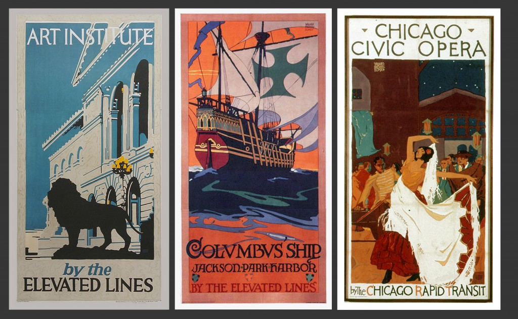
 The thought of Chicago in the 1920s usually conjures up images of gangsters, Prohibition and other Roaring 20s clichés, but there was another movement in the Chicago area that encompassed this decade. It inhabits the world of graphic art and has gone relatively unheralded, especially outside the Windy City region – The Insull Transit Posters.
Samuel Insull (1859-1938) left his British home in 1881 for New York to become Thomas A. Edison’s assistant. He eventually worked his way up to become one of the founders of what we now know as General Electric, and in 1892 left New York to helm the financially struggling Chicago Edison Co. In general terms, Insull’s most important contribution to modern life is his dedication to the idea that electricity use should be for the common consumer and not a novelty of the rich. He believed in providing electricity to as many customers and at the lowest price possible. Much of what we take for granted today in terms of the use and distribution of power and energy can easily be attributed to his groundbreaking ideas and efforts. By the 1920s Insull owned shares in all the major Chicago area utilities as well as the region’s transit lines, specifically the Chicago North Shore & Milwaukee (North Shore Line), Chicago South Shore & South Bend (South Shore Line), Chicago Aurora & Elgin and the Chicago Rapid Transit (Elevated/”L”) Lines. He solidly invested in programs to modernize, consolidate and publicize their existence and offerings. The poster campaign he initiated is but one aspect of the comprehensive program of advertising and promotion he developed.
It’s my contention that a good deal of what inspired Samuel Insull in the use of graphic art for his utility posters and marketing efforts during the 1920s must have come from what he witnessed Frank Pick was simultaneously implementing with the use of art and design in the London Underground’s poster and branding campaign.

The London Underground's Frank Pick (1878-1941)
Insull traveled extensively to his U.K. homeland throughout his years in America, and what he saw and learned in Britain could often directly influence how he ran his utilities in Chicago. For instance, while visiting Brighton, England, in 1894 he noticed that many of the shops that were closed for the evening were still brightly lighted – something unheard of in the “flat-rate billing” world of the United States. After tracking down the head of that township’s electric company, Insull was introduced to the use of a “Demand Metered” billing system. It applied different rates to different times of the day. Upon Insull’s return, Chicago soon saw a similar approach as well as an eventual 32 percent cut in rates for the consumer. Insull’s use of poster graphics so closely on the heels of Pick’s approach in the U.K. seem so similar that I have to believe it’s more than coincidence. The major difference, however, is that Pick’s influence is still evident in the identity of London Transport – from the use of Edward Johnston’s font “Johnston Underground” (commissioned by Pick and precursor to Gill Sans – Eric Gill was a student of Johnston’s) to Johnston’s “Roundel” logo, and the continued marriage of varied graphic art styles within LU promotion, the hand of Frank Pick continues to guide the company’s image. It’s a truly remarkable demonstration of how a strong, consistent branding vision can withstand the test of time yet continue to feel fresh. I’ve always seen it as a precursor to what MTV did when it was sculpting its image in the 1980’s – commissioning the talents of independent animators to design and produce short network IDs in varied techniques and styles, but always reinforcing the core MTV sensibility.
Below: A select group of London Underground posters

Frank Newbould 1929 - C. Paine 1921 - E. McKnight Kauffer 1921

Maxwell Armfield 1915 - A. Rogers 1930 - V.L. Danvers 1924
The control of the utilities and transit lines in 1920s Chicago offered Insull all sorts of opportunities to cross-promote his empire. He could encourage the development of rural areas into suburban communities by stretching his railways out and making them commutable into the city. This not only created customers for the transit lines, but also new subscribers to Insull’s electric utility network – it all tied together. And the land used by the utilities to run their electric lines via high tension towers could also be utilized as a right of way for the expansion of the railways. As a result, it totally made sense to entice the masses to leisurely explore the virgin countryside and in the process offer potential homeowners a cleaner (electric railways were void of the soot and cinders of steam railroads) and more pastoral existence. This is obvious in many of the posters’ imagery. Chicago’s transit lines had been doing advertising and even some poster designs since the 1910s, but there was no consistent graphic approach or what we now know to be “branding” in the direction of the marketing. This all changed once Insull took hold of the Elevated Rapid Transit System and the associated interurban lines. He soon assigned the poster project to the railroads’ president, Britton I. Budd, who later brought people like the North Shore Line’s Publicity Manager Luke Grant and Commercial Department Head John J. Moran, into the fold.
 (Reuters/Yuri Gripas)
Britton I. Budd (1871-1965)
The design of the posters covered a wide range of styles. From the figurative work of artists like Willard Frederic Elmes and the young Oscar Rabe Hanson to the flat graphic interpretations of Ervine Metzl, many of the works produced were as strong and bold as anything being created simultaneously in the U.K. or Germany. The series not only utilized the talents of professional artists like Leslie Ragan, Elmes and Metzl, but also was a proving ground for newcomers like Hanson, and other art school students like Clara Fahrenbach and Wallace Swanson.
The depression of the 1930s not only effectively shut down the production of the poster campaign but also destroyed Insull’s entire empire. His electricity, gas and transportation utility and holding companies that served 5,000 communities in 32 states soon collapsed and he found himself indicted on multiple charges – and ultimately acquitted in each and every verdict. By the end of all legal proceedings in 1935, Samuel Insull was ruined. He and his wife, Gladys, settled in Paris and on July 16, 1938, Insull was felled by a heart attack. Ironically, he had been stricken while awaiting a train in the Paris Metro…
The Chicago transit posters designed between 1920 and 1930 received a fair amount of attention in the U.S. and the U.K. They won medals in several Art Directors Club annual competitions and to this day there are eight examples in the collection of the Victoria & Albert Museum in London. Once the transit poster campaign ended in 1930 the collection of images drifted into obscurity. It would take 45 years and an exhibition organized by Dave Gartler and his Chicago vintage poster shop Poster Plus, to resurrect them. Gartler came into an archived cache of them that had never been used and were still in their original folded condition. He painstakingly restored and mounted them for an exhibition in his gallery and they’ve been highly sought after collectibles ever since. Almost all the images in this article are included here thanks to Dave and Poster Plus. He remains the expert authority in this realm.
I’ve included some minimal biographical material on W. F. Elmes, Walter Graham, Ervine Metzl and Leslie Ragan. Except for these designers, biographies of the artists involved have been most elusive, so I hope readers don’t feel I’ve done an injustice to the artists or the subject matter.
As far as I know, the following assemblage is the most comprehensive collection of the Insull Transit posters ever gathered together in one article. I’ve listed the following images together alphabetically by the artist…
________________________
Harry Walters Armstrong 1883-1954

1924
________________________
Ivan V. Beard 1896-1980

1927 - - - - - - - - - - - - - - - - - - - - - - - 1927- - - - - - - - - - - - - - - - - - - - - - - 1928
________________________
Robert Beebe 1896-1965

All 1923
________________________
Carroll Thayer Berry 1886-1978

1927
________________________
Roy F. Best

1922
________________________
Emil Biorn 1864-1935

1929
________________________
Otto Brennemann 1864- ?

All 1926

All 1926

1927 - - - - - - - - - - - - - - - - - - - - - - - 1928 - - - - - - - - - - - - - - - - - - - - - - - 1929
________________________
Willard Frederic Elmes 1900-1956

1922 - - - - - - - - - - - - - - - - - - - - - - - 1923 - - - - - - - - - - - - - - - - - - - - - - - 1923

Both 1923

All 1924

Both 1925

1925- - - - - - - - - - - - - - - - - - - - - - - 1926 - - - - - - - - - - - - - - - - - - - - - - - 1928
Elmes’ also contributed to the Mather & Company 1924 motivational poster series profiled by Steven Heller here.
________________________
Francis Raymond Elms 1906-1984

1927
________________________
Norman Erickson 1884-1964

1925 - - - - - - - - - - - - - - - - - - - - - - - 1925- - - - - - - - - - - - - - - - - - - - - - - 1926

All 1926
________________________
Clara B. Fahrenbach 1886-1976

1927
________________________
Walter Graham 1903-2000

1929
I was fortunate enough to speak to Walter Graham in 1998 about his work and also sent him a copy of his Insull poster, which he’d lost long ago. He freelanced as an illustrator/artist after he finished school in 1928 and had his own commercial art studio, Nugent-Graham Studios in Chicago, from 1937 until he left for the Northwest to retire as a full-time painter in 1950.
________________________
Oscar Rabe Hanson ? -1926

All 1923

All 1923

All 1924

All 1924

All 1926

1926 - - - - - - - - - - - - - - - - - - - - - - - - - - - - - - - - - - - - 1927
________________________
Raymond E. Huelster 1890-1955

1927- - - - - - - - - - - - - - - - - - - - - - - - - - - - - - - - - - - - 1928

Both 1929
________________________
Arthur A. Johnson 1898- ?

1923 - - - - - - - - - - - - - - - - - - - - - - - 1924- - - - - - - - - - - - - - - - - - - - - - - 1924
 (AP)
(AP)Both 1924

Both 1925

All 1925
1925- - - - - - - - - - - - - - - - - - - - - - - 1925 - - - - - - - - - - - - - - - - - - - - - - - 1926
________________________
Charles B. Medin
 (David J. Phillip)
1925 - - - - - - - - - - - - - - - - - - - - - - - - - - - - - - - - - - - - - - 1929
________________________
Ervine Metzl 1899-1963

Both 1921

1923- - - - - - - - - - - - - - - - - - - - - - - 1923- - - - - - - - - - - - - - - - - - - - - - - 1924
Ervine Metzl was arguably (even when considering the prolific career of Leslie Ragan) the most successful of all the artists in the Insull poster series. He designed posters, did several covers for Fortune, and illustrations/covers for other magazines and books, and was as a designer for U.S. Postal stamps from 1957-60. He’s credited with helping along a young Paul Rand by pairing him up with a NYC ad agency in the 1930s and introducing him to the influential package/industrial designer George Switzer. Metzl served as a mentor to a young Ron Barrett, designer/cartoonist/humorist, and later illustrator of “Cloudy With A Chance Of Meatballs.” Metzl also wrote an early definite study of poster history “The Poster” in 1963.
________________________
Datus Ensign Myers 1879-1960

________________________
Rocco D. Navigato 1895-1942

1923- - - - - - - - - - - - - - - - - - - - - - - 1924- - - - - - - - - - - - - - - - - - - - - - - 1925

All 1926
________________________
Walter Necker

1927
________________________
Ruth A. Olson

1925
________________________
Leslie Ragan 1897-1972

All 1927

1927- - - - - - - - - - - - - - - - - - - - - - - 1927- - - - - - - - - - - - - - - - - - - - - - - 1928
Leslie Ragan made a career out of designing railroad travel posters. Beside the half dozen scenes he did for the South Shore Line, his work for the New York Central Lines, Norfolk & Western and the Budd Corporation, produced over one hundred images.
________________________
Wallace Swanson

1925
________________________
Hazel B. Urgelles ? -1989
 1923- – – – – – – – – – – – – – – – – – — – 1924- – – – – – – – – – – – – – – – – – – – – – – – – – – 1925
________________________
(2 remaining posters by unknown artists)

1924
 (Screenshot, Youtube)
(Maybe Harry Walters Armstrong ?)
__________________________
As an added bonus, I’ve decided to include rare examples of the original gouache paintings done by some of the artists as designs for their posters. Nowadays, a photographic and usually digital process is used to reproduce posters in quantity. The artist’s original design is simply reproduced in whatever form the final piece needs to be in. Back then, the lithography process used to (re)produce these posters involved taking an artist’s artwork (in this case 15″ x 22″ water-based gouache paintings on board) and translating the designs to separate lithography stones – one for each color. The lithographer’s objective was to faithfully reproduce everything from color to texture and then register all the separate color levels during the printing process to replicate the original design. The final image was also enlarged to the standard 27″ x 41″ (one sheet) poster size for exterior display on the train platforms, etc. What’s interesting are the changes made between when the artist finished his painting and the final poster was printed. Sometimes, for specific reasons lost to time, the text was changed as evidenced when comparing the paintings to the final product. (BTW, as far as I know, the “Winter-Fields By The North Shore Line” poster only exists as a gouache painting, I haven’t been able to locate a lithograph poster print of it yet.)
The original gouaches are below with their various sources/credits included underneath the image.
 (AP/Pablo Martinez Monsivais)
Laura Hedien - - - - - - - - - - - - Dave Myers

Dave Myers - - - - - - - - - - - - - - Dave Myers - - - - - - - - - - - - - - - - - - -B. Mooney Photography- Chicago

Hopkins Stolp Peffers
________________________


Pages from 1928 and 1927 Art Directors Club annuals.

1920's Edwards & Deutsch Lithographing Co. picnic photo (Nice squeeze-box !). E&D was one of the firms in Chicago chosen as lithographers for the posters along with National Printing & Engraving Co., Illinois Lithographing Co., and Gugler Lithographing Co.

A brochure from the 1910s era prior to Insull's poster program showing the extensive use (see below) of poster advertising along the elevated system.

The four sets of photographs below show how the Insull Transit posters were mounted on-site. By enlarging shots like these, I’ve been able to discover posters not found anywhere else. The detail in these pictures is truly remarkable.
 (AP/Richard Drew)
E/NE view of Linden Avenue stop, Wilmette, IL

Loyola Station looking south on Sheridan Road, Chicago, IL
 (Getty Images/Cavan Images)
Northeast view of Isabella stop, Evanston, IL

Left: Edison Court/Waukegan. Il. Top right: 5 Mile Road/Racine, WI. Bottom Right: Indian Hill/Winnetka, IL.
Even though the Insull poster campaign was discontinued by the onset of the Depression, there was a revival of sorts of the program in 1997. Addressing many of the same reasons that the original posters were created — to stimulate residential, commercial, and industrial growth, Mitch Markovitz (formerly the art and advertising director of the South Shore Line in the ’80s) was commissioned by the Northwest Indiana Forum to produce new posters. Mitch served as the founding artist and art director of the campaign and produced a run of lovely images in the process. The works of Markovitz not only took inspiration from the original series, but paid a respectful homage to Leslie Ragan in particular. I’ve included several examples of Mitch’s work below…
 (Mark Humphrey)
Contemporary posters by Mitch Markovitz
Corrie Lebens and Zero Lastimosa were endlessly patient and helpful in working with me on the production of this piece.
The other people and organizations that I’ve relied upon (over a 15-year period) to help me cook this casserole are: Dave Gartler and his Poster Plus shop/gallery, John Gruber — an amazing photographer/editor/writer/historian –, Mitch Markovitz, the late Arthur D. Dubin who connected me with SO many people who have become good friends and collaborators, John Horachek, Bob Harris, Laura Hedien/Tom Herrara, Graham Garfield, Norm Carlson, Walter Keevil, the late George Krambles, his nephew Art Peterson and the “Krambles-Peterson Archive”, John Wasik, Cousin of Ervine Metzl — Karen Kohn, Erich Knautz, Dave Myers, Eric Bronsky, the late Walter Graham, Martin Tuohy, Britton Budd descendent James Delacour, Ken Fletcher, Scott Gendell, Al Louer, Denny Mayer, Malcolm D. McCarter, Ed Tobin, Barbara Mooney, Wilmette Historical Museum, Milwaukee Public Library, Highland Park Historical Society, and the Chicago History Museum (formally the Chicago Historical Society).
Finally, please refer to the book, “Moonlight In Duneland” by Ronald D. Cohen & Stephen G. McShane 1998 Indiana University Press for a great profile of the Insull Transit Poster campaign. It concentrates primarily on the work done for South Shore Line, but still nicely analyzes the overall series.
