It’s still a sneaker ad. But it’s one with a story that anyone who’s ever dreamed of fleeing the workday world for a daring adventure can enjoy.
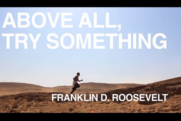
Casey Neistat says that Nike gave him a nice big budget to create a new ad with the imperative – I mean hashtag, because Nike is all up in that social media thing — to #makeitcount. Instead, according to the video, he took the money and sprinted around the world with a friend for 10 days. This result is basically a Successories poster crossed with your cousin’s Facebook wall come to life – images of pretty locations like the Eiffel Tower and the Great Pyramids, interspersed with inspirational quotes from the likes of Helen Keller and Mae West and Hunter Thompson. No wonder the clip has amassed nearly a million views — and, no doubt, millions of “God, why can’t I be that guy?” sighs of envy — in under two days.
It takes the idea of “run” not to the expected sneaker ad place of basketball courts and marathons, but the other place, the “take the money and” one. Jump off a cliff. Get a tattoo. Meet girls in bikinis. You know, just do it. It’s a cliché used to peddle footwear, but it’s an infectious, spirited one. And it’s a whole lot more fun than a lecture from Dad.
Of course, this entire video is not just a testament to the human spirit but also to the growing craftiness of corporate viral advertising. It’s unlikely that Nike was unaware of Neistat’s plan when he went off to shoot it (even rebellious ad producers are subject to oversight by their clients), and the video allows the company to seem anti-authoritanian at a time when it’s very popular to hate our corporate overlords. It effectively and subtly co-opts our current Occupy zeitgeist; stick it to the Man: Buy Nike!
In a simpler time, when automobiles went slower and the pre-Eisenhower highway system in the United States was less developed, there was a popular advertising campaign that ran from 1927 until 1963. It consisted of rhymed messages sequentially staked on the right side of the road, all ending with the advertiser’s name, “Burma-Shave.”
Examples of vintage Burma-Shave road signs, including a blue South Dakota version. (Ray Crockett photo)
These red ads (one state, South Dakota, insisted that they be dark blue to keep them from conflicting with the red reserved for warning notices) usually consisted of five signs. For example: “DON’T PASS CARS/ON CURVE OR HILL/IF THE COPS DON’T GET YOU/ MORTICIANS WILL/BURMA-SHAVE.”
Some slogans touted Burma-Shave as a pre-aerosol “brushless” shaving cream—a cream you could scoop out of a jar and lather onto your face without relying on an old-fashioned brush and moistened soap in a mug.
("Thoroly"? I guess if the word doesn't fit the composition, change the spelling. . .)
In 1925, Clinton Odell, a Minneapolis lawyer, took the liniment his father created and transformed it into a brushless shaving cream. He named his company Burma-Vita—Burma, because most of the essential oils in the liniment were from the Burmese portion of the Malay Peninsula, and Vita from the Latin for “life”: “Life from Burma.”
Some of Burma-Shave’s primary “brushless shaving cream” competitors were Barbasol and Noxema.
The company was sold to Philip Morris in 1963, and all the signs were removed soon thereafter. As a testament to the campaign’s cultural significance, a set of signs was donated to the Smithsonian, where it still resides. But the brand eventually petered out. After being sold yet again (this time to the American Safety Razor Company) and then reintroduced in 1997, it never regained a hold in the market.
A history of the Burma-Vita Company, written by Frank Rowsome Jr. and illustrated by Carl Rose, was published by the Stephen Greene Press in 1963.
By the early 1960's, the rising costs of road-sign maintenance (as well as new and more effective ways of advertising) sounded the death knell for the Burma-Shave signs.
The following pages from Frank Rowsome Jr.’s book list all the road-sign Burma-Shave phrases produced from 1927 to 1963.
Copyright F+W Media Inc. 2012.Salon is proud to feature content from Imprint, the fastest-growing design community on the web. Brought to you by Print magazine, America's oldest and most trusted design voice, Imprint features some of the biggest names in the industry covering visual culture from every angle. Imprint advances and expands the design conversation, providing fresh daily content to the community (and now to salon.com!), sparking conversation, competition, criticism, and passion among its members.
I became interested in pop bottles (I grew up in the Chicago area where we all said “pop”) and related stuff when I was about 12 years old. I had gone inside an old garage that was attached to a neighborhood house that was being torn down and inside was a cache of un-returned pop bottles that must have dated from the 1940-’50s period. I took one of each type home (about 20 of ‘em) and yes, still have them to this day. I really got off on all the different labels and colors of glass and because I used to like to read old magazines I actually recognized most of the brands that were no longer around or had changed their design. I’ll go into this more in a future post, but wanted to lay some sort of a foundation for this piece, which is exclusively on 7Up, with a special focus on their branding efforts of the 1950s.
The soft drink that would be known as 7Up was created in 1929 by Charles Leiper Grigg in St.Louis as part of his “Howdy” line of sodas and was originally called “Bib-Label Lithiated (it contained the mood stabilizer lithium citrate until 1950) Lemon-Lime Soda.” It was almost immediately re-labeled “7 (7 natural flavors) Up Lithiated Lemon-Lime,” and then finally just “7Up”.
The first 7Up logo from 1929.
In terms of logos, an original winged trademark soon gave way to the red squared logo that lasted until the late 1960s that coincided with that period’s brilliant “Uncola” re-branding campaign. I always felt they had GOLD in that Uncola moniker. . .
A 1935 7Up label before the Howdy Company's name was changed to 7Up in 1936, followed by two Howdy beverage labels.
By the late 1940s 7Up was the third most popular soft drink in the United States. By the time the 1950s rolled around, the company had employed extensive branding techniques to keep the momentum going. The following three binders contain examples of what was offered to the bottlers and distributors to reinforce the product’s presence.
A catalog of 7Up sales/marketing items circa 1954.
This page includes tipped-in glossy paint chips.
These next three pages would NEVER fly with the HR Dept in 2012. . .
Before everyone had TV's in their home, it was common to go out to watch television.
7Up Sales & Promotion Merchandise Catalog circa 1954 - 59.
(would love to have those binders. . .)
Actual cloth swatches included.
More swatches.
1959 "Salesmakers" Catalogue
2 actual decals using the older logo with the woman reaching for bubbles- love the way the color is broken down into separate shapes and levels.
Actual booklet attached.
"Fresh Up Freddie" was the 7Up mascot created in 1957 by ad agency Leo Burnett and Walt Disney to help sponsor the Disney "Zorro" TV series.
Left: 1940's bottle with 8 bubbles on label. Right: 1950's bottle 7 bubbles.
"Like" was introduced in 1963 as a diet version of 7Up. It contained Calcium Cyclamate which was determined to be a carcinogen in 1969. "Like" was discontinued in that same year and Diet 7Up was introduced in 1970 sans the Cyclamates. This bottle is dated 1964.
Late 1960's/early 1970's can.
"The Uncola".
As a final footnote, I was lucky enough to work on spots for 7Up International using the Susan Rose/Joanna Ferrone character “Fido Dido”! Here’s one of my favorites done while I was at the Ink Tank Studio in N.Y.: http://www.youtube.com/watch?v=8JpHjeGXyw8
Salon is proud to feature content from Imprint, the fastest-growing design community on the web. Brought to you by Print magazine, America’s oldest and most trusted design voice, Imprint features some of the biggest names in the industry covering visual culture from every angle. Imprint advances and expands the design conversation, providing fresh daily content to the community (and now to salon.com!), sparking conversation, competition, criticism, and passion among its members.
As if Michael Jackson wasn’t creepy enough when he was alive. The self-proclaimed King of Pop, who died nearly three years ago, is making a return via a new Pepsi campaign. The fabulously un-self-aware tagline? “Live for Now.”
The corporation is set to festoon one billion cans of Pepsi around the world – that’s one billion cans – with the singer’s unmistakable silhouette. It’s a bold move for a company whose most famous association with Jackson is that back in 1984, his hair caught fire filming a commercial for them. Jackson’s estate orchestrated his sponsorship resurrection, and a family spokesperson confirmed to the Wall Street Journal Thursday that “more such marketing agreements are planned.” Did anyone else just feel that collective shudder of revulsion?
Even dead, Jackson is a massive draw. He’s currently the subject of a global Cirque du Soleil tour with the horror movie title “Immortal.” And Pepsi knows that overseas – especially in markets like Asia — his brand is as ubiquitous and American as well, cola.
There comes a time when a celebrity passes into our iconography. Today, seeing the images of Elvis and Marilyn and James Dean in different pop culture contexts barely seems any stranger than fake Abraham Lincolns selling cars in February. And why wouldn’t Jackson’s people wring a few more opportunities out of his incredibly lucrative image? Somebody’s got to pay for all those $10 million mansions.
Senior PepsiCo marketing executive Frank Cooper told the WSJ that the new campaign will be both “respectful” and “forward looking.” It may be respectful. But there’s nothing “forward” about the dead. Jackson’s image survives as an easy symbol of pop music, but the man whose life ended from propofol intoxication three years ago, whose doctor is currently serving time for involuntary manslaughter, couldn’t seem less like the right spokesman for the notion of “living for now.”
Somewhere, Charlie Sheen is laughing and saying, “At least I never did that.” This week, we learned what’s even less funny than Ashton Kutcher: Ashton Kutcher in brownface.
In an ill-advised Popchips ad spoofing online dating that launched Wednesday, the “Two and a Half Men” star appeared as a variety of love-hungry “World Wide Lovers” vying for your affection. In a spectacular display of racial tone-deafness, one of them included “Raj.” Raj, all darkened skin and heavy accent, is “a Bollywood producer looking for the most delicious thing on the planet.” He’s looking for something “Kardashian hot … I would give that dog a bone.” He brags that he once won a milking contest, and he does a little dance that will haunt your nightmares.
Shockaroonie, some people found this offensive. The ad went the wrong kind of viral, with a social media explosion of negative feedback. It’s not that comedy with a racial element is always wrong wrong wrong. The Jewish Hank Azaria is currently in his third decade of playing the Indian Apu Nahasapeemapetilon on “The Simpsons,” and nobody seems to be outraged about this. Kutcher’s incredibly unnuanced performance isn’t that, though. On his blog, writer Anil Dash explains it perfectly – “a fake-Indian outfit and voice” constitute “the entire punchline” of the clip. And, as he eloquently put it, “I can’t imagine I have to explain this to anyone in 2012, but if you find yourself putting brown makeup on a white person in 2012 so they can do a bad ‘funny’ accent in order to sell potato chips, you are on the wrong course. Make some different decisions.”
And so that’s what Popchips is trying to do. On Wednesday, in a “message from Keith” on the company’s website, its founder, CEO and foe of proper capitalization Keith Belling wrote, “we received a lot feedback about the dating campaign parody we launched today and appreciate everyone who took the time to share their point of view. our team worked hard to create a light-hearted parody featuring a variety of characters that was meant to provide a few laughs. we did not intend to offend anyone. i take full responsibility and apologize to anyone we offended.” That’s a constructive, self-aware response to a potential public relations disaster. (Kutcher, who in recent months has been tainted by his hasty Twitter support for Penn State coach Joe Paterno and a divorce that featured rumors of unprotected extramarital sex, has so far had no comment on the problematic ad campaign.)
It’s a positive thing that Popchips understood its mistake and made an immediate effort to rectify it by pulling the ad. That step forward is mitigated somewhat, though, by the a large number of “get over yourself” responses on Anil Dash’s blog. We’ve still got much work we need to do in this country around issues of stereotypes and sensitivity, folks.
You don’t have to look any further than the entire Popchips campaign to see what I mean. Its remaining “World Wide Lovers” include the stoner Brit “Nigel,” who’s “seeking higher planes of consciousness” (GET IT????), the effeminate German “Darl” — a swishy riff on openly gay designer Karl Lagerfeld — and the dumb redneck “Swordfish.” In the end, there’s also regular old, newly single Kutcher, who describes the other guys in the club as a “freak show.” Hey, geniuses at Popchips – you’re still perpetuating gross generalizations. Also: They’re not funny. It’s a great big snack-loving country. Being cool about brown people – and gay people, and people others would call “white trash” – shouldn’t be such a crunch.
The Federal Communications Commission voted 2 to 1 this morning to require broadcasters to post political ad data on the Web, making it easier for the public to see how as much as $3.2 billion will be spent on TV advertising this election.
The files — which, among other information, detail the times ads aired, how much they cost, and whether stations rejected ad buy requests from campaigns — are currently available only on paper at stations.
The FCC rejected a push by the industry to water down the measure. But the rule as passed also has serious limits. For example, the data will not be searchable or uploaded in a common format.
The rule will first apply to affiliates of the four major networks (ABC, CBS, NBC and Fox) in the top 50 TV markets. All other stations will have until July 2014 to come into compliance.
“[L]arge areas of some swing states, like Virginia, Missouri, Wisconsin and Michigan, could see an influx of advertising in markets outside of the top 50,” the Sunlight Foundation noted in an analysis today. It was also not immediately clear exactly when the rule will go into effect for the top 50 markets.
Then there’s the crucial question of the format in which the files will be available. FCC spokeswoman Janice Wise told ProPublica that the commission is not creating a searchable database of the political ad files.
“We’ll accept whatever [file] format they provide,” she said in an email.
That will make it much more difficult to analyze the information.
Wise said there are no specific plans to make the database searchable.
By opting to allow stations to submit political data in any format, the commission departed from a recommendation made last year by in an FCC working group report. The report called for the political file to be put online and that “as much data as possible [be] in a standardized, machine-readable format” that “could also enhance the usefulness and accessibility of the data.”
Also not clear is how the broadcast industry, which vigorously lobbied against the rule, will react.
“[W]e will be seeking guidance from our Board of Directors regarding our options,” the National Association of Broadcasters said in a statement decrying the vote.
In March, the industry group submitted a filing with the commission raising “serious questions about the FCC’s authority” to require stations to put political ad data online.
“That was written as a legal memorandum, which is code for, ‘We’ve lawyered up and we’re ready to sue over this,’” says Andrew Schwartzman, a longtime FCC watcher at the Media Access Project.
The broadcasters’ group declined to comment beyond its statement.
On a Thursday earnings call for Belo Corp., one of the companies that has been fighting the disclosure measure, CEO Dunia Shive suggested that broadcasters would continue to fight the new disclosure rule.
“I don’t think the conversation is over with respect to being able to continue talking about if we will ultimately have to include ad rates online,” she said, Broadcasting & Cable reported.
Belo spokesman R. Paul Fry told ProPublica that the company merely “want[s] to continue the dialogue on this subject.”
The FCC also said today it would review the new rule after a year to see if any changes need to be made before all stations will be required to come into compliance in July 2014.