
One of the big differences between a type designer and a calligrapher is that nobody much wants to watch a type designer at work. Creating and refining a font is painstaking work that requires a fastidious nature, to say the least. Calligraphy is an action sport by comparison – measured in seconds rather than months – and watching a calligrapher at work is oddly thrilling. The stakes aren’t exactly high (there’s usually another piece of paper available…), but they somehow feel high:
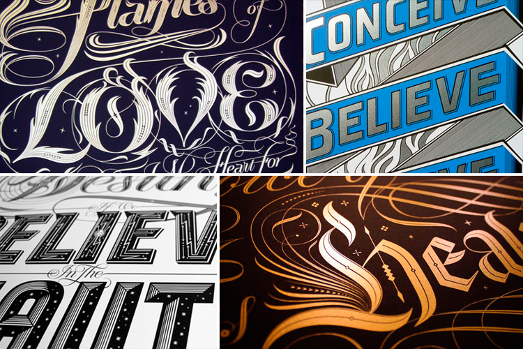
The artist in this video is Seb Lester, seen improvising a beautiful alphabet in real time, filling the page with swift, effortless strokes. But as the video plays on, we also start to see other of his works – impossibly ornate type illustrations. There is a meticulousness to the mind at work here, and he clearly has more than pen and ink in his arsenal. In fact, Lester is known mainly as a type designer and illustrator, and only recently decided to learn the art of calligraphy. He has been at it for about two years now.
Chances are, you have seen his work – he has designed typefaces for clients ranging from British Airways to H&M, and type illustrations for Nike, Apple, and The New York Times. When Penguin needed a type illustration for the cover of the reissue of “The Catcher in the Rye,” they hired Seb Lester. No pressure.
What first got you interested in letterforms?
I gravitated towards letterform design in college when I was 18 and haven’t looked back. I stumbled across a book in the library called The Graphic Language of Neville Brody. He is responsible for some iconic design and I was struck by the graphic power of his work. That was the first time I thought about designing letterforms and it quickly became a passion. I think the Latin alphabet is one of our most beautiful creations.

What was the first time someone hired you to make a work of art?
One of my claims to fame is my first job when I left college was helping design a Rolling Stones Tour book. It was the Bridges to Babylon Tour book. I never met the band but I was told that Mick Jagger preferred my cover design which is the one that ended up being used. Exciting times.
I felt very lucky to get that Stones gig straight out of college. I was young and when I got paid I’d never had so much money before. I almost immediately flew to New York with a friend and burned through it all in a week. The second job I got was animated typography for a Genesis world tour. So from a rock and roll perspective my career peaked with the first two jobs I ever had and it has been down hill ever since.

What is the most challenging project you’ve ever undertaken, and how did it change you?
It was designing a typeface called Soho which is a typeface designed for use in corporate identities and publications. It took me about 3,000 hours to design and has tens of thousands of characters because of all the different weights, widths and languages it supports. It was a personal project I was doing it in my spare time whilst working full time as a type designer. It involved a certain amount of sacrifice but projects like this further improved my skills and knowledge and laid the foundations for everything that has followed including my more expressive works.
One of the ways it changed me is I put on 20 lbs from sitting on my arse for three years drawing it.

What is your first step when you start a new project?
I do a diverse range of work – typefaces, logos, typographic illustrations and art but whatever the project I always start with a sketchbook and pencil. That is really important. With all the advances in technology we have in 2013 a pencil and paper is still the quickest, most intuitive and convenient way to flesh out ideas.
How do you know when it’s finished?
With client work it has to be finished when it has to be finished, so that’s when it’s finished. With personal work that’s a lot more difficult. You could tweak intricate designs for an eternity. I caught myself adjusting curves in some artwork recently that I could barely see zoomed in 6400% on a computer screen. At that point I decided it was probably time to stop.

If your computer were taken away from you tomorrow, would you still be able to make a living doing what you do now?
I’ve gone back to basics in recent years and placed a lot of emphasis on traditional tools, drawing and calligraphy so I think I’d be fine. I have realized that calligraphy makes me a better type designer with digital tools and vice versa. There is a beautiful synergy between the two. There is also something very satisfying about making expressive marks and calligraphy has a humanity and expressive quality hard to capture with a computer. A personal motto at the moment is learn new old skills.
I’m doing a heraldry course, learning medieval gilding techniques and writing with goose quills. So every day I make a 1,400 year leap in cutting edge tools and techniques. This is unusual and I hope interesting work will come from it. This return to making things using traditional tools isn’t self indulgence. My first calligraphy commission was for Nike and so it has very real commercial applications. There is a real appetite for hand made art and design at the moment.

Do you have a favorite letter?
My favourite letter depends on the font or category of typeface in question, so I don’t really have a favourite letter per se. I suppose in sans serifs generally I’m fond of capital S’s. They’re the hardest character to draw generally because they share the least characteristics. But with a formal script the capital X is often the most beautiful, it’s very sensual with lots of elegant flowing curves.
Do you have any design pet peeves?
All designers have pet peeves. It goes with the territory. I have the standard nerdy preoccupations with letter spacing and white space. The biggest mistake non designers make in my opinion is they often use too many fonts in one document. You really only need two for most things.

What would you most like to improve in your work?
I’d like to continue to steadily improve my calligraphy. The received wisdom is it takes ten years to become a master calligrapher, if you’re lucky. I’ve only been doing traditional calligraphy for about two years but I have a lot of prior experience with digital letterforms so I’m hoping to fast track the process.
What would be your dream assignment?
A logo for a space ship would be about as good as it gets, so if anyone from NASA, or any other government space agency, is reading this please bear me in mind. I’m totally serious. I think my skills are well suited to design for luxury products because of my emphasis on craftsmanship and quality so maybe more prestigious work in that field. But I’m just grateful I can make a living doing something I love. All I ever really remember wanting to do since childhood is make beautiful art and design. That is a dream assignment in itself. Creativity is a profoundly beautiful thing.

