The year 2013, if you choose to believe the rigorous data released yesterday by the National Oceanic and Atmospheric Administration, tied for the fourth-warmest on record. Although, if you listen to NASA instead, it was actually the seventh-hottest. Its precise ranking — influenced by differences in data processing — isn’t very important. When it comes down to it, both agencies are saying the same thing: Last year was unusually hot — one of the hottest since 1880 — and it followed a pattern in which unusually hot years are becoming the new normal.
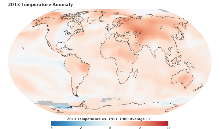
Be it a polar vortex or a record-breaking heat wave, it’s not one unusual weather pattern we need to look at — it’s the progression of things getting more and more unusual over time. An animation of temperature anomalies over 130 years, provided by NASA, shows how that’s indisputably been the case. Note the growing number of red-colored zones where temperatures were warmer than average, which take over the map as time goes on. This is what scientists say when they emphasize the importance of long-term climate trends:
