Air temperatures for 2014 may have made headlines for being the hottest ever recorded, but it turns out that ocean temperatures did them one better: they actually broke the charts.
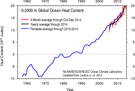
Specifically, they broke this chart, which NOAA updates every few months, and which needed to be rescaled (see the earlier version, above); the new, roomier version is now live at NOAA’s National Ocean Data Center:
")
This is a big deal, and not because scientists had to redo a chart. As the Guardian’s John Abraham explains, talking about surface temperatures isn’t the same as talking about global warming — the latter refers to the total amount of heat within Earth’s energy system. And most of that heat — more than 90 percent of it — goes into the oceans.
In other words, charts like this, which show the rapid rise of ocean temperatures, are one of the best visualizations we have for what global warming looks like. The full story takes atmosphere and land temperatures into account, too, and together, Abraham writes, it means that “We can now say that the 2014 Earth had more heat (thermal energy) than any year ever recorded by humans.”
This is the chart that should have you seriously frightened about the very real impact that human activity is having on Earth’s temperature — especially if you consider scientists’ warnings of what will happen once all that stored heat is released back into the atmosphere. It’s also a chart that you can throw in the face of anyone who tries to argue that global warming has “paused,” because there’s no denying a trend this strong.
