I realize that most people have a hard time getting sentimental about airlines, but some of us do, and another well-known national carrier is about to vanish. Air Jamaica is closing down. Effective this month, its routes are being taken over by Trinidad-based Caribbean Airlines, which will set up a hub in Kingston and become Jamaica’s de facto national airline.
Air Jamaica has been around since 1968, and its route system once reached Europe. Caribbean Airlines is itself something of a carpetbagger. For almost seven decades the airline of Trinidad and Tobago was BWIA — British West Indian Airways. Founded in 1939, BWIA had become the largest airline in the Caribbean and, like Air Jamacia, flew as far as Europe. BWIA shut down on the last day of 2006 after a series of failed labor negotiations, and Caribbean Airlines was created to take its place. A portion of ex-BWIA staff were retained, albeit at substantially lower wages.
Caribbean Airlines’ hummingbird logo replaced the iconic steel pan (or steel drum if you prefer) motif worn for many years by BWIA, seen here on an old L-1011. A later, less attractive version looked like this. In its closing years, BWIA had changed its name to “BWIA West Indies Airways,” which if you think about it took redundancy to a new level. All together now: British West Indian Airways West Indies Airways.
Something else Air Jamaica and BWIA will have shared: a virtually perfect safety record. BWIA went 66 years without recording a single passenger fatality. Not even Qantas, wrongly believed by many to have a flawless record, can say that (its last fatality was in 1951). Unless something tragic should happen very quickly, Air Jamaica will retire with a perfect record as well.
A heavy mantle for Caribbean Airlines. So far, so good.
Speaking of carriers on the skids, JAL — Japan Airlines — recently filed for bankruptcy protection. It was Japan’s largest-ever filing. The airline has a $25 billion debt load, and as part of restructuring will part with roughly a third of its 15,000-plus workforce.
I’m thinking JAL will pull through, and when they do, I wonder what the new company will look like — literally. Traditionally when airlines emerge from bankruptcy, they do so with a new corporate identity — a fresh new typeface, logo, and livery. It’s a symbolic thing, a morale thing, and a way to get that bad taste of your creditors’ mouths.
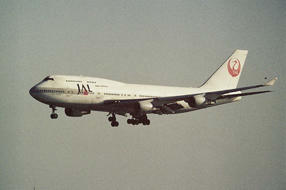
Here’s hoping that as part of JAL’s inevitable rebranding it decides to bring back its famous crane motif, the Tsurumaru. Since 1960 every JAL aircraft featured this stylized depiction of the crane, lifting its wings into the circular suggestion of a rising sun. It was, at least in my opinion, one of the most elegant airline logos ever conceived.
Alas, beginning in 2002 this ageless symbol succumbed to what is probably the most regrettable makeover in aviation history, replaced by something so awful that every JAL plane deserves to be concealed under a black tarp: a giant, blood-red “rising splotch” oozing across the tailfin. Behold. Unpardonable, especially as the crane holds such cultural importance in Japan.
Corporations monkey with their identities at their own considerable peril. This is especially true of national airlines, and if JAL has any sense it will resurrect its classic and beautiful bird.
