
 The following is adapted from the introduction I wrote to the catalog of Graphic Intervention: 25 Years of International AIDS Awareness Posters 1985-2010, which will be shown for the first time in New York at the Art Directors Club on June 6. The exhibition will be on display from June 7 – July 29, 2011.
Over a quarter century ago the HIV/AIDS virus began killing thousands and infecting hundreds of thousands more. Although the Western world was hit unaware, the disease had been coursing through the Third World’s bloodstream for years before. When Europe and the Americas were directly impacted, however, curative and preventative measures were gradually instituted, yet prejudice abounded. After all, this was a “gay” disease.
With death tolls on the rise, mainstream and alternative media eventually rallied to dispel demonizing half-truths and myths. It wasn’t until 1993 when Tom Hanks and Denzel Washington, in the film “Philadelphia,” made a dent in the wall of denial (and fostered the fashion for red ribbons on Oscar night). As more victims in the creative industries were struck down, international celebrities took to their soapboxes. Amid their heartfelt clamor, and in addition to a surge of kinetic mass media, the most prodigious barrage of information was nonetheless disseminated through more static media — the printed poster.
Even in this hyper media, information saturated age, printed pieces of paper continue to influence and inspire, incite and inform. Anyone who says this is hyperbole should look closely at this exhibition. The poster, a universal medium and, arguably, the most affordable means of accessibly conveying cautionary messages, has been essential in the war against AIDS. Before viral videos circulated throughout the web, posters held sway and crossed all boundaries. Today posters go where WiFi cannot.
Posters were (and are) the great equalizer in countries where paper is a high tech medium. Although verbal and visual languages and dialects may be different, a poster can make the difference between ignorance and understanding. A poster campaign, in fact, triggered my own wake-up call to the issue — and this was no thanks to public health officials at the time. In the late 1988 Gran Fury, the graphic design spin-off arm of ACT-UP (AIDS Coalition to Unleash Power), launched a missive attack throughout New York City to caution gays and enlighten straights. I wasn’t the only one who was ignorant of the facts. Accurate Health Department information was hard to come by, even though the gravity of this illness demanded accessible educational materials. For me, awareness began with an enigmatic pink triangle (and its reference to Nazi concentration camp branding of homosexuals) and the slogan “Silence=Death” (at first an enigmatic but later highly recognizable slogan). My education continued with posters that at once celebrated alternative life- and love-styles as well as promoting widespread condom use for all. The most startling and effective Gran Fury message was placed on the outside of city buses that read “Kissing Doesn’t Kill, Greed and Indifference Do.” In a style reminiscent of Benetton advertisements, couples of different races (man and woman, man and man, woman and woman) fondly kissed. The image itself was doubtless a shock to many, but the overall message, that AIDS existed but it needn’t be feared or cause prejudice, was even more profound. This and subsequent advertisements by ACT-UP, Gay Men’s Health Alliance and other groups eventually contributed to mass awareness.
Every nation hit by the disease — which is almost every nation — has tapped into posters and poster artists for their persuasive propagandistic powers. It isn’t a new phenomenon. Cautionary posters have been tools of awareness before AIDS. In the 1940s and ’50s VD — syphilis and gonorrhea — was the scourge, but it wasn’t until posters promoting prophylactics were distributed that curative measures were discussed in public. Decades later it was important that AIDS be well defined. Yet it was long treated as mysterious and sinister.
Initially, even New York Times obituaries, considered the finest reporting of their kind, did not report HIV/AIDS as a cause of death. But invariably the reality was as infectious as the virus. During the early 1990s, virtually every day, one or more obituaries referenced AIDS. Not since the 1920s, when infantile paralysis was such a life-threatening specter, had a health emergency evoked such fear — or aggressive visual response. Just as the iron lungs became the visual icons of poliomyelitis, the emaciated, cadaverous human form covered with lesions, as seen in a mid-1990s advertisement produced by Olivierio Toscanni and Tibor Kalman for Benetton, crystallized the human suffering. With mainstream media treating AIDS as a real illness, not some mere perversion, more and varied forms of awareness and information dissemination were developed. Around the globe different cultures visualized AIDS in ways that were acceptable to their respective populations.
Yet how many different ways are there to say HIV/AIDS? The answer, rightly, depends on the context. It is one thing to show the Benetton ad in a magazine or on a billboard and yet another to show it on television. A static image can be viewed in a contemplative way, a kinetic one could be construed as an attack on an unwitting viewer. Understanding what the public will accept at any given time or venue (what the industrial designer Raymond Loewy called “most advanced yet acceptable”) is not an exact science but demands good instincts. Designing in particular vernaculars, across different borders and for varied constituencies, is what makes the posters in this collection so compelling.
No single design language fits all problems. The level of intensity of a message must be weighed against the kind of response or action that is wanted and expected. With AIDS it is not enough to advertise to fund a cure or advocate prevention; degrees of emotional investment must be considered. Is that done through design, image or text? Do the standards of “good” design or “modern” design matter? Is a message best served by simplicity or complexity? And what, if any, are the taboos — the lines that artists and designers cannot cross?
In the West many AIDS posters polemically attack the issue, yet in India, for instance, they more touchingly convey stories designed as warnings to alter common behavior. Using vernacular imagery rendered in popular styles, one such poster written in Hindi states: “My husband has gone to the city to make more money, I hope he does not contract AIDS while he is there. But if he resists temptations then he can never bring AIDS back home. Sexual intercourse without proper precautions results in the spread of AIDS … My beloved has gone overseas to earn a living. I hope he does not return with AIDS. Protect yourself from a strange woman, so that AIDS may never enter. AIDS spreads due to unprotected sex!” Another from India shows an even more compassionate side: “People suffering from AIDS need love. Not disgust, not abandonment, but just love.” In Uganda, heavily hit by AIDS in the early 1990s, posters are designed to encourage detection and treatment, like this: “What does a person with AIDS look like? AIDS can look like many other diseases. Don’t be confused. Don’t spread rumours. See a qualified medical person for tests if you think you or someone you know may have AIDS” or this “Can you spot which person carries HIV? The answer is no! The AIDS-Virus can hide in a person’s blood for many years. People who carry HIV may look and feel healthy, but they can still pass HIV to others!”
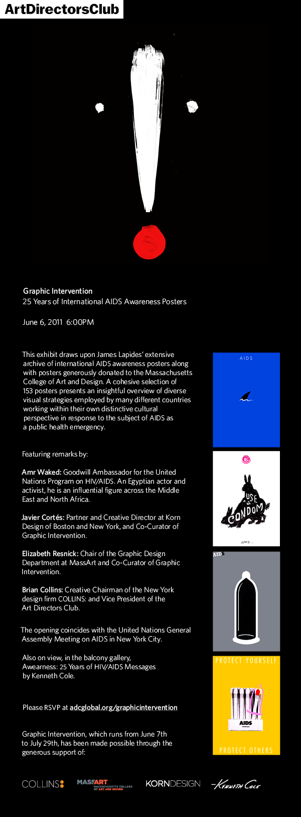
Some of the most politically and emotionally charged posters in Jim Lapidous’ collection are not necessarily the best designed or conceived compared to those in the world’s pantheon of posters. But they hit the message like a hammer. “I Have AIDS Please Hug Me: I Can’t Make You Sick” is a heart-wrenching plea. The overly clichéd faux childlike drawing and lettering that serves to underscore the message on its own is poor art but together is compelling. Indeed more compelling than the tulip and rose in the “Make Love, Not AIDS” poster, which unfortunately evokes the aesthetic of a tired greeting card — however, if it works who can complain. Much more intelligently conceived, the UNICEF “United for Children, Unite Against AIDS,” with the paper hat/boat in a red sea of mines, may be too clever for its audience, or just clever enough. The same might be said for “AIDS” showing a shark fin emerging from a sea of blue. Nice design, but other than cautioning the viewer to beware, what is the message? One of the more powerful is “Condoman,” which speaks in the universal comic book language in a witty way that informs rather than preaches.
Yet attempting to evaluate these posters is not easy — and arguably unnecessary — since each nation represented has its own unique priorities. Effectiveness is not decided on whether the typography is pristine or the drawing is nuanced. Although the niceties help (and for designers they are essential), the receiver’s ability to comprehend is the deciding factor. If “AIDS: Don’t Be Afraid Be Aware” captures attention then the poster has done its job. If “Senza? Senza di me” lulls the viewer into the security that this is a billboard for an everyday product, like milk, and then hauls back and lobs the “Stop AIDS” bomb, then bravo! And while the ribbon poster from Finland could be typographically improved, the transformation of the AIDS ribbon into a mother embracing her son is as emotionally striking as a poster can be.
Twenty-five years have passed since the first of these posters was created. Many more than the 150 presented here have been produced. They reveal the ability to use graphics as an information tool and intervention weapon, and show that a balance must be struck between aesthetics and communication. Can posters stop a disease? Obviously not! But depending on where they are made and whom they impact, they can make a huge difference. They may only be paper, but they are tough and durable.
Copyright F+W Media Inc. 2011.
Salon is proud to feature content from Imprint, the fastest-growing design community on the web. Brought to you by Print magazine, America’s oldest and most trusted design voice, Imprint features some of the biggest names in the industry covering visual culture from every angle. Imprint advances and expands the design conversation, providing fresh daily content to the community (and now to www.salon.com!), sparking conversation, competition, criticism, and passion among its members.
