 Collecting matchbox labels is called phillumeny; its obsessive proponents are phillumenists. One reason there are so many phillumenists is because there are untold matchbox (and matchbook) graphics that can be found in virtually all corners of the globe.
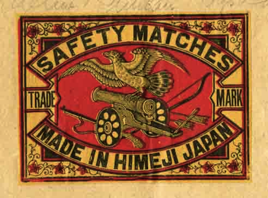
Among the industry leaders Japan was exceptionally prodigious, and the designs produced were various, plentiful, and consistent with the early 20th-century expansion of the nation’s heavy industries. Commercial art played an important role, in general, as it developed brand recognition and sales for new industrial products. It put Japanese graphic designers at the forefront of what is now called “branding.” The designers were seriously influenced by imported European styles such as Victorian and Art Nouveau, which is evident on these matchboxes (and later by Art Deco and the Bauhaus, introduced through Japanese graphic arts trade magazines, and incorporated into the design of matchbox labels during the late 1920s and ’30s).
Western graphic mannerisms were harmoniously combined with traditional Japanese styles and geometries from the Meiji period (1868-1912), exemplified by both their simple and complex ornamental compositions. Since matches were a big export industry, and the Japanese dominated the markets in the United States, Australia, England, France, and even India, matchbox design exhibited a hybrid typography that wed Western and Japanese styles into an intricate mélange. The domestic brands, however, were routinely designed in a more reductive — though typically Japanese — manner solely using Kanji characters.
In Japan, matchboxes were a mainstay of daily, vernacular culture. Safety matches became important staples in part because they satisfied a primal social need (fire), and because of the nation’s substantial lumber industry that supplied a near endless supply of material. The largest Japanese match manufacturers, including Shungen & Co., Mitsui & Co., Seiryukwan, and Koyoukan Binnaka Seizo, from Osaka, Koshi, and Himeji, were all well known, but the artists who created their respective designs were purposely kept in the shadows — like most commercial artisans in other quotidian fields. Anonymity was the fate of those who produced the most vibrant, as well as the most ephemeral, products of the Japanese popular arts. Nonetheless certain manufacturers were known for certain styles designed to appeal to different aesthetic tastes. Nisshinsha’s labels often featured a central “trade mark” (a rabbit suggesting good luck) or a vignette (two-winged cherubs framing a globe), while Shiyosegumi Seizo’s labels were heavily typographic with tiny images integrated into the overall design.
But for the most part, the labels followed a standard template that was developed in the late 19th century and was maintained for decades.
(These matchbox labels come from a petite rice paper album c. 1905.)


 (Smith Collection/Gado/Getty Images)

Copyright F+W Media Inc. 2011.
Salon is proud to feature content from Imprint, the fastest-growing design community on the web. Brought to you by Print magazine, America’s oldest and most trusted design voice, Imprint features some of the biggest names in the industry covering visual culture from every angle. Imprint advances and expands the design conversation, providing fresh daily content to the community (and now to www.salon.com!), sparking conversation, competition, criticism, and passion among its members.
