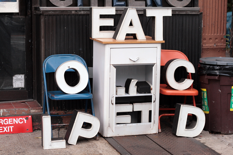
Vernacular Typography is the creation of graphic designer and Brooklyn native Molly Woodward, who has spent the past decade taking photos of the city’s “found lettering.” All over the city, and the world, local signage is disappearing and being replaced with mass-produced signs and the brands of global corporations. Molly is trying to preserve it–and she has a Kickstarter campaign to help do that.
I asked her a few questions about “endangered local signage.”
How are you defining “Vernacular Typography”?
I guess it should technically be Vernacular “Lettering,” but I define Vernacular Typography as the found lettering that exists in the built environment and surrounds us everyday. It doesn’t have to be pretty or use an existing typeface, it’s just any visual representation of language.
How do you think New York City’s vernacular typography differs from other cities around the country and the world?
New York’s vernacular typography is unmatched in terms of intensity and variety of signage. On any given block, you can see the city’s forgotten history through the layers of still-visible signage in basically any medium. The typescape is also much denser than in other places because the city evolves so rapidly and retail turnover is so high.
Which New York City typefaces are your current favorites?
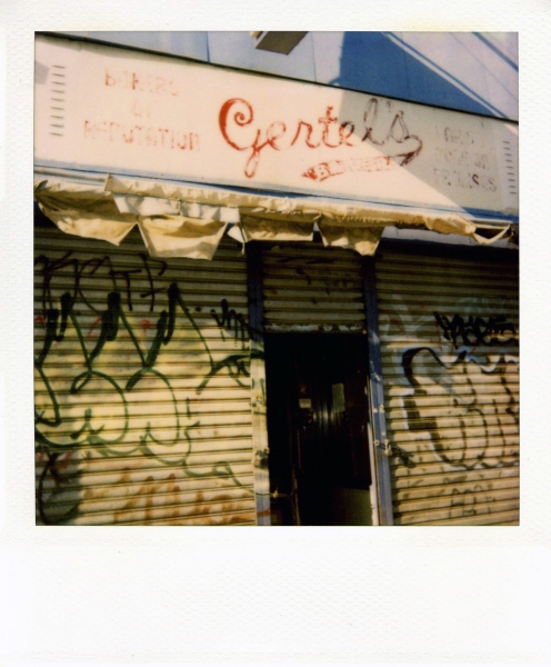
I’m partial to the type and signs I grew up seeing every day, most of which have disappeared (Gertel’s Bakery) or whose surfaces seem to be slowly melting away (Ideal Hosiery).
I love any type that somehow still clings to life or relates directly to a time and place (Horn & Hardart Automat).
And of course, you can never go wrong with beautiful neon (Montero’s).
What do we lose when the vernacular typography of the city streets vanishes from sight?
A sense of the city’s history, and also a precious visual resource. Typography can you tell you a lot about local culture and urban communication and when we don’t see it, our sense of the city is diminished.
What do you think might be the psychological impact of living in a city where the native typography is replaced by homogeneous corporate signage?
I think there’s less of a personal connection to a specific place. With standardized corporate advertising, signs are no longer representative of a group of people or a neighborhood, just a business that could be anywhere in the world.
For natives, connections to the past are lost, so a sense of home or a memory of a place is devalued. And for visitors, there’s less of the unique experience you get from traveling someplace new.
Vernacular typography is such an incredible marker of regional identity, spatial orientation and even personal history. If we lose it altogether, we not only lose that individual and cultural connection, but also a physical map of the city, which is why documentation and preservation are so important.
