The Olympic rings are already everywhere, and starting in a few days they are going to be everywhere.
We needed a graphic to let people know that Salon’s coverage is going to be different — the Olympics seen through Salon’s unique lens.
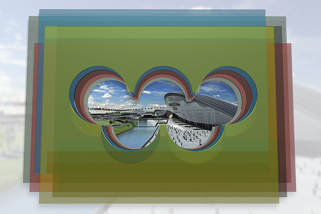
For the design, we chose to create a viewfinder out of (virtual) translucent panes. When aligned, the panes suggest the Olympics logo, but with a twist on that familiar geometry. The colors aren’t quite what you’re used to either, and what’s more, they combine in very unexpected ways.
You’ll see this graphic in the coming weeks, attached to stories that focus on Olympic themes and details that you won’t find elsewhere.
Let us know what you think.
