Apple’s world domination has just taken another step forward: The company with the world’s largest market recently decided that the letters and numbers we look at when we use their devices would undergo a change. The Cupertino-based corporation rolled the new font out gradually and quietly – one of the first appearances was on jackets Apple gave out – but it’s landed now and starting to provoke responses, some of them quite sharp. “The world’s most beloved typeface has been dumped,” Wired reported earlier this summer:
After two rocky years as Apple’s typographical identity, Helvetica Neue is being replaced by a bespoke font, San Francisco, as the default font on both OS X El Capitan and iOS 9 this fall.
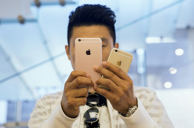
San Francisco is the first in-house typeface Cupertino has designed in more than 20 years. With its clean, compact shapes, subtle roundness, and ample space between letters, San Francisco was no doubt designed for maximum legibility on the Apple Watch.
But the new font won’t stop at the watch – the new operating systems will bring it to your iPhone and laptop and desktop as well.
What motivates the change? Partly, it’s that San Francisco looks better at smaller sizes, which is crucial as digital devices and their display screens get smaller. (Fans of Helvetica Neue are surely quoting Gloria Swanson about how it’s the picture that got small.)
And while there’s a range of reactions – some people, of course, like it – a lot of the reviews have been negative. “As if figuring out how to operating a new operating system wasn’t jarring enough, Apple apparently sent newly christened iOS 9 users into shock by introducing a new font,” the Digiday site judged, quoting users who describe the new typeface unfavorably: One feels “personally victimized,” another calls it “hella ugly,” yet another writes that it “looks like I’ve downloaded it off some dodgy Chinese app.”
Some of the resistance is not exactly aesthetic, but comes from people who don’t like sudden change in matters on which they’ve not been consulted:
Will the backlash build? It’s kind of fun to contemplate a massive movement against a once-cool, now ubiquitous company becoming a kind of symbol of how isolated citizens all over the world could cause a dominating empire to reverse itself, but it probably won’t happen.
If it does, the resistance against San Francisco (the font, it’s worth mentioning, has the same name as a once-artsy city that is now squeezing out its artists) could learn something from the fight against Comic Sans, a goofy font released by Microsoft in 1994 and eventually marginalized by vitriolic critics.
There is a blog called, basically enough, Ban Comic Sans (“We believe in the sanctity of typography and that the traditions and established standards of this craft should be upheld throughout all time,” its manifesto reads.) And “an e-mail written in this font makes the sender seem ridiculous and out of touch,” a post on the Prepressure blog about hated fonts says. “I honestly think when I see Comic Sans that the person has a lower than average intelligence level.”
But the real damage to Comic Sans came from a McSweeney’s piece — an imagined monologue by Mike Lacher — that showed that a lone scribe could still make a difference in the world.
You don’t like that your coworker used me on that note about stealing her yogurt from the break room fridge? You don’t like that I’m all over your sister-in-law’s blog? You don’t like that I’m on the sign for that new Thai place? You think I’m pedestrian and tacky? Guess the f*ck what, Picasso. We don’t all have seventy-three weights of stick-up-my-ass Helvetica sitting on our seventeen-inch MacBook Pros. Sorry the entire world can’t all be done in stark Eurotrash Swiss type. Sorry some people like to have fun. Sorry I’m standing in the way of your minimalist Bauhaus-esque fascist snoozefest. Maybe sometime you should take off your black turtleneck, stop compulsively adjusting your Tumblr theme, and lighten the f*ck up for once.
Until an essay as strong as the McSweeney’s piece – something by a digital-era Thomas Paine — comes along and galvanizes Apple users worldwide to toss their watches in the sewer, turn off their iPhones, and so on, we’ll probably have to live with the new typeface.
And until then, folks should calm down about the San Francisco font. Sure, Apple is a scary, world-dominating corporation that cruised on its reputation for cool until it had pulled us all under its spell and established sweatshops all over the world. But this font is harmless. Compared to, say, Papyrus or Brush Script, San Francisco is really fine.
