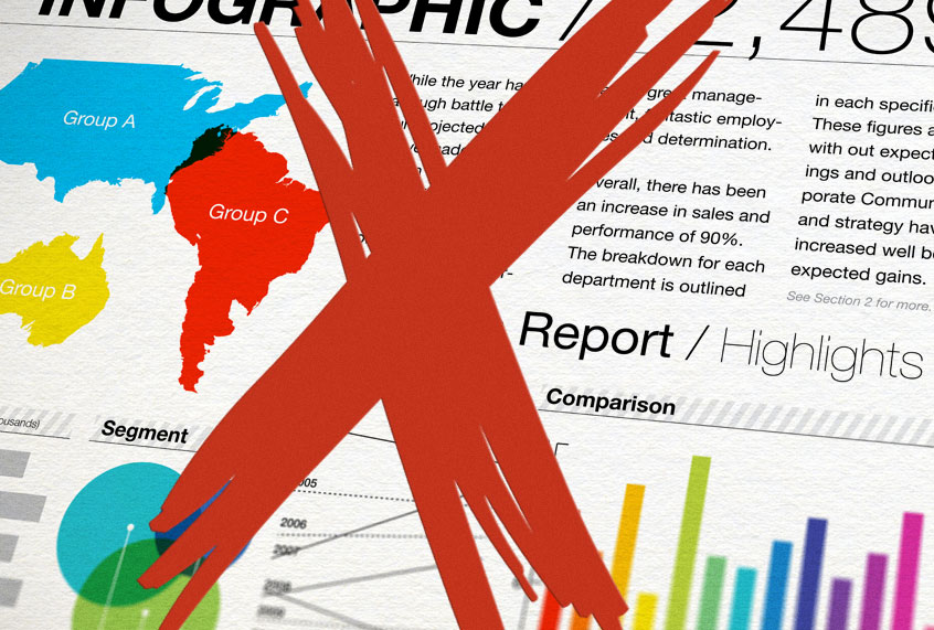
Infographics have become big business. The slickly-designed vertical images featuring charts and statistics and oft-destined for virality started life as an internet hobbyist innovation, spread on Reddit and Pinterest. Now, they’re primarily the realm of professionals, as PR firms and businesses routinely commission and distribute them to journalists, hoping to get their brand featured in an article.
Yet as any former high school math teacher will tell you, infographics are often poorly-cited and/or opaque about the data, sample sizes and statistical methods that went into their creation — raising some serious questions over statistical methods. (Disclosure: I am a former high school math teacher, and I am telling you this.) Most journalists have news “whitelists” for reporting, a shortlist of magazines and newspapers whose journalistic methods are similarly sound, and who can be trusted for reporting; for us, the New York Times is a yes, while tabloids are a no-no. But reporting on infographics does not seem to have the same vetting process. And while I would certainly exercise extreme skepticism of any infographic that was not transparently created by an academic institution, other journalistic outfits are not so scrutinizing.
Last month, The Windsor Star, an Ontario-based newspaper of record, spun an entire article out of an infographic embedded in a blog post from online real estate marketing company ZooCasa. The next week, a different ZooCasa infographic about the Vancouver real estate market had to be retracted due to persistent data errors.
I am not the only journalist to present skepticism about infographics. In 2015, io9 published an entertaining roundup of nonsensical viral infographics that they discovered circulating the web; one them credited “MedicalBillingAndCodingCertification.net” as its originator. Victoria Reitano, a social media marketer who previously worked as a reporter for Patch.com, says that she does not consider infographics an inherently accurate factual source.
“I see infographics as a story-telling tool for anyone in the communications space,” Reitano told Salon. She noted how easily stats could be skewed: “If [an infographic] is coming from, say, a company that sells almond milk, and they want to tell you how their processes have helped grow more almonds in a better way, and then they have this great infographic about almonds… that is almost certainly totally skewed.” Likewise, an infographic about real estate from a real estate company may be similarly suspect.
“That’s my issue with data online in general,” Reitano added. “All data can be skewed to tell a better story.” Reitano says she would be more apt to trust an infographic from a non-profit source or a think tank.
So why do some journalists report on commercially-produced infographics as though they were factual? My suspicion is that many journalists might not have studied statistics, nor do they have a scrutiny of statistical methods or data analysis methods that others might have. But a bigger issue is that the fast-paced world of online journalism has resulted in many journalist seeking out shortcuts. When news moved online, the advertising revenue became worth far less: “print dollars become digital dimes become mobile pennies” is an industry maxim to describe the comparatively dismal ad revenue sums from online ads as compared to print ones. Smaller per-article ad revenues mean that news outlets need to publish more articles in order to make back what they’ve lost — and of course, the people at the bottom of the hierarchy, the entry-level journalists, bear the brunt of that.
When she was a reporter at Patch, Reitano notes that she was required to fulfill a story quota every day. “When I was fresh out of school, working at Patch, I knew that I had to do six stories a day to keep my job,” she told Salon. And indeed, she and her fellow reporters were often encouraged to report on infographics that arrived in their inboxes. “It was like, this is something you can use, it looks good, use something visual,” she says.
“I think that that pressure leads to misinformation or disinformation sometimes,” she elaborated.
It is astonishing that more pundits don’t blame the scourge of “fake news” on Silicon Valley slurping up huge sums of ad revenue that previously would have gone to publishers; Facebook, Google and Twitter are hugely at fault for the sloppy journalism that happens down the chain as a result of their sapping dry of the ad industry, by serving as middlement between content production and distribution. A study released last week from News Media Alliance claims that Google reaped $4.7 billion in ad revenue from “news content” in 2018. For context, the entire American digital news industry made 4.3 billion in digital advertising in the same year, according to Business Insider.
My point is that the world of infographics is the Wild West right now: these are new visual forms of conveying information, and standards for vetting their sources haven’t coalesced yet in the journalism world. Likewise, their publication on news sites seems to bend journalistic integrity: the media does not exist to serve as a free PR organ for private industry, but often that seems to be exactly what’s happening. It’s far healthier to view infographics as you would any other advertisement — as that is what most of them are.
